Verizon Kids
CASE STUDY • TCS INTERACTIVE • UX/UI DESIGN
— creating a kids-centered experience for Verizon’s TV, app and web platforms for a more streamlined experience.

Role
Product Designer
Product Designer
Team
Valerie Lianggara
Julia Jang
Emil Sengati
Claire Lorman
Valerie Lianggara
Julia Jang
Emil Sengati
Claire Lorman
Skills
UI/UX DesignVisual Design
User Research
Workshops
UI/UX DesignVisual Design
User Research
Workshops
Tools
Figma (& FigJam)
Figma (& FigJam)
Timeline
September 2022 - Ongoing
September 2022 - Ongoing
The Brief
To define and design a unified kids experience that flexes across the full suite of Verizon video products.
A more tailored experienceCurrently the kid’s experience operates as more of a curated page or genre with some additional parental controls. There is a chance to create something much more unique and engaging. Ultimately, this will provide value to both the user and the business.
Identifying key features
As we work through the Kids experience we should be looking proactively at features and opportunities that add the most value to our younger users. These can be ambitious or purely functional. These can then be presented back to client.
Curation opportunities
It is important to consider the implications the introduction of a kids profile experience could have on products such as the console. A profile based experience would open up opportunities here that we should explore.
Some of my day-to-day responsibilities include:
︎︎︎ Conducting user research and testing
︎︎︎ Creating use case libraries and journey maps
︎︎︎ Creating graphics and illustrations
︎︎︎ Design decisions and prototyping
The Verizon Kids project took part in four stages before launching its MVP product:

ONE: THE FOUNDATIONALS
EXISTING
Current Platform
VMS (Video Media Server)
The current VMS has a full kids experience that was previously designed. This did not in the end get built so we used this as a reference.
(INSERT IMAGE)
FCL (Fios Custom Launcher)
For this platform kids was essentially just treated as a genre with some additional parental controls.
(INSERT IMAGE)
Stream TV
Similar to FCL stream simply treated Kids as a genre with parental controls. However, recently they have introduced a 2nd level browse view with more kids content and bespoke visuals.
(INSERT IMAGE)
Console
Console support for a Kids experience is mainly limited to sub-portals. There is potentially much more we can do with this and lots of opportunities which might inform curation strategies.
(INSERT IMAGE)
EXPLORE
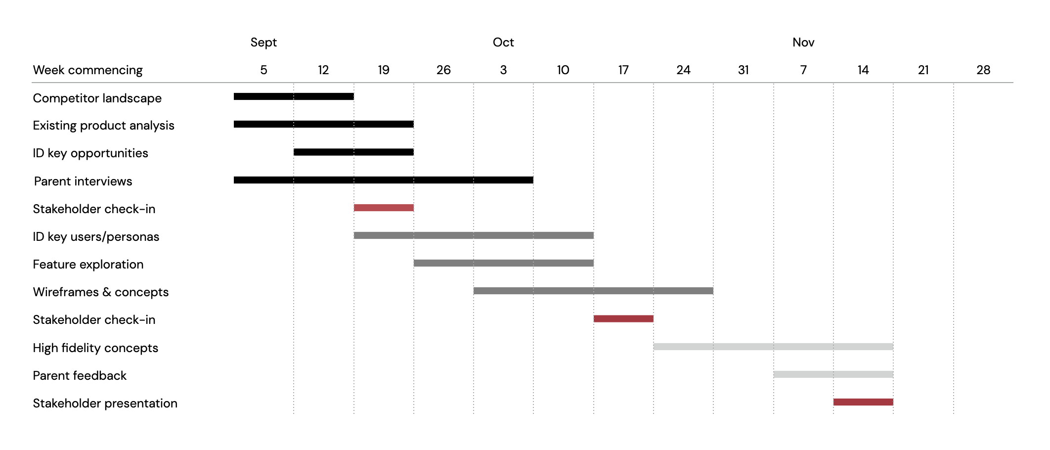
As a team, we started out this project by putting some foundations in place, such as meeting cadence and setting up some initial research tasks amongst each other. We listed out our intial goals and created a project plan with a timeline that would help us stay on track.
![]()
Foundations
As a team, we started out this project by putting some foundations in place, such as meeting cadence and setting up some initial research tasks amongst each other. We listed out our intial goals and created a project plan with a timeline that would help us stay on track.
EXPLORE
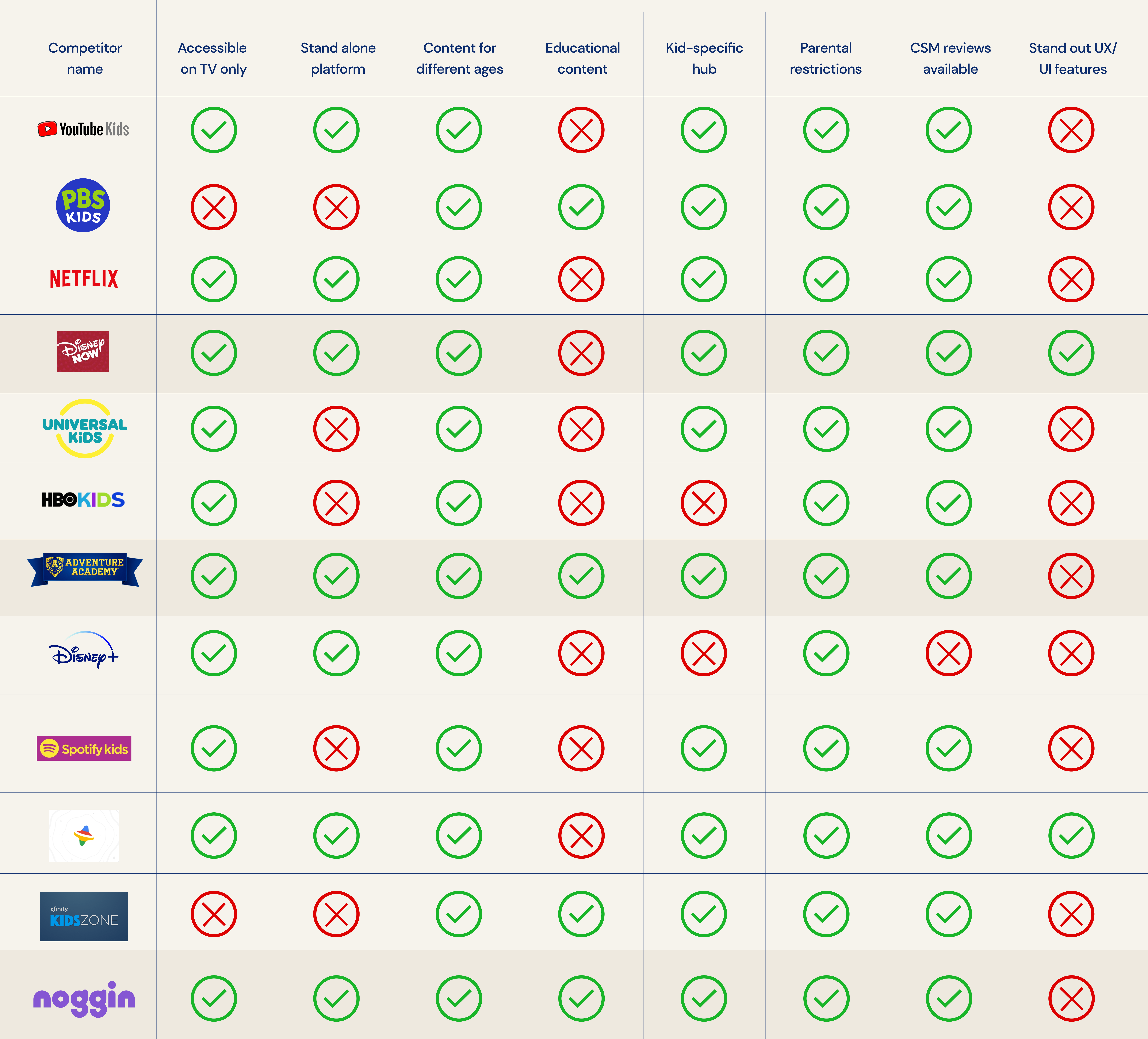
Acknowledging the existing platforms, we conducted a landscape analysis to highlight what Verizon does/doesn’t do well.
![]()
We also wanted to set some design guiding principles to determine what we believe represents a successfully designed experience. These are some factors we consider to represent success:
Landscape Analysis
Acknowledging the existing platforms, we conducted a landscape analysis to highlight what Verizon does/doesn’t do well.

We also wanted to set some design guiding principles to determine what we believe represents a successfully designed experience. These are some factors we consider to represent success:
Spans different age groups
Being able to adapt to the different development stages a child goes through, and being inclusive by considering accessibility needs.
Controlled and curated content
The ability to implement a profile-like feature that promotes personalization and conscious consumption, with algorithms promoting inclusivity and smart discovery.
Engaging and educational
Having mindful and engaging micro-interactions and educational content that allow parents/guardians to feel at ease.
Nuanced parental controls
Allowing parents/guardians to set maturity controls for different aged children, depending on their personal constraints.
Going back to the brief and distilling the objectives, we created this graph that represents the ideal platform that sits at a 3 way intersection:
![]()

RESEARCH
We reviewed 12 different streaming competitors that cater their content towards kids and reviewed the different features they have to offer. From this comparison, it is evident which competitors come out on top from the metrics we specified.
![]()
insert explanation here
Competitor Analysis
We reviewed 12 different streaming competitors that cater their content towards kids and reviewed the different features they have to offer. From this comparison, it is evident which competitors come out on top from the metrics we specified.
insert explanation here
RESEARCH
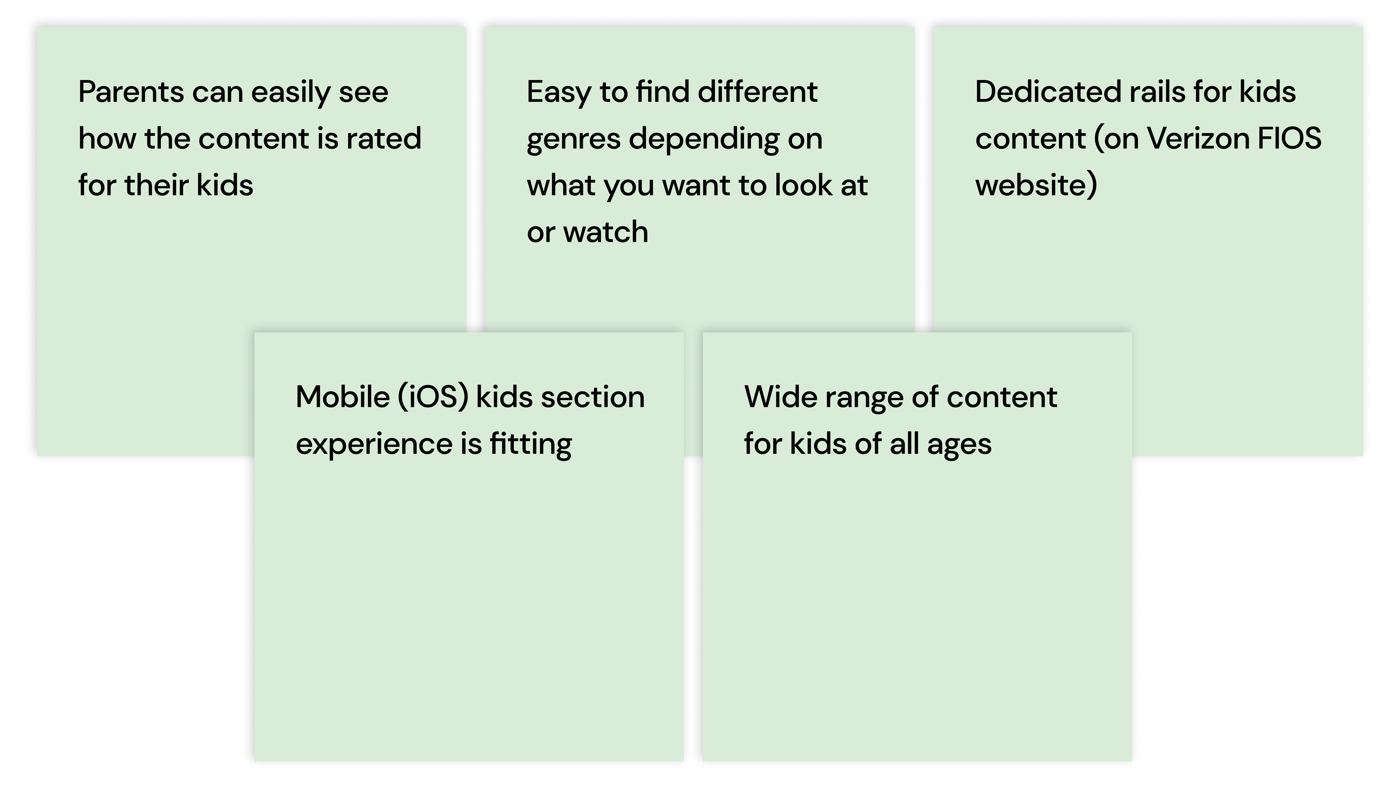
Currently, Verizon does have a kid’s section of the platform and acknowledges that it is built specifically for a younger age group. However, there are obvious gaps in what they currently offer to families that are large white space opportunities. CONTINUE
![]()
![]()
Existing Product Analysis
Currently, Verizon does have a kid’s section of the platform and acknowledges that it is built specifically for a younger age group. However, there are obvious gaps in what they currently offer to families that are large white space opportunities. CONTINUE

RESEARCH
Although this platform is focused on kids, we have to focus just as much on the parents. To better understand the intersection of kid and parent needs, we spoke to parents who had a range of kids age-wise. Our chat with Liam helped us understand more of a “future vision” for the product.
![]()
Parents Interview
Although this platform is focused on kids, we have to focus just as much on the parents. To better understand the intersection of kid and parent needs, we spoke to parents who had a range of kids age-wise. Our chat with Liam helped us understand more of a “future vision” for the product.

During our interviews, we asked parents questions as well as conducted a co-creation exercise with them. We used this method to better understand their priorities when it comes to their ideal digital platform, and gave us solid direction in planning out our key UX features.
![]()
Some key insights from our interviews:
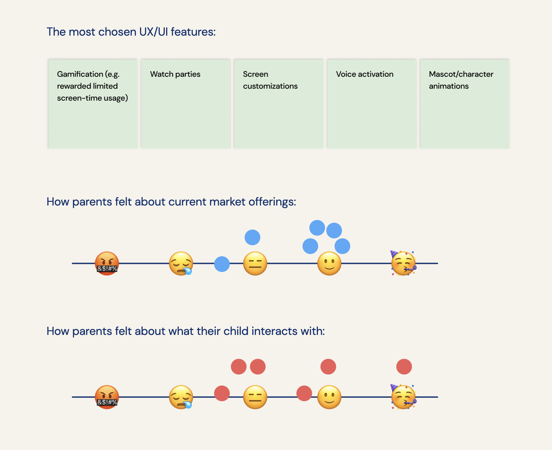
Some key insights from our interviews:
ONE
Promote digital platforms as a social enabler
Increased technological use among kids is inevitable. Instead of seeing it as a harmful distraction, it can be transformed into a trustworthy tool that enables meaningful connections. Parents see the value in having digitally connected kids, as it helps their development and widens their world view.
Opportunities: ‘safe friend’ networks, international social channels, digital socialization hours
TWO
Nurture quality time through shared digital experiences
Surprisingly, many parents cite watching digital content as the most treasured time with their kids. An opportunity exists to curate content that enables this valued and meaningful time - a digital platform can be the driving force behind initiating quality time and can be a catalyst to memorable parent/child bonding experiences.
Opportunities: content preference quiz for parents and kids to take together, designated social time with content chosen by the whole family
THREE
Prioritize learning style, not age guardrails
No two kids are the same in learning style or what they want to be exposed to. The ideal platform should understand this, and adapt to what the user is ready to see, not their age on paper. It should have built in features that placate parents and children alike, and erases the stigma around official age vs. maturity level.
Opportunities: level content depending on learning style and maturity, similar content suggestions
FOUR
Value discussion over rigid parental controls
Parents expressed how they want to prioritize discussing content and having visibility with their kids over just outlawing things outright. These discussions are seen as gateways to having more valuable and mature parent-child conversations and actually help parents trust the platform more than they would with a restrictive profile.
Opportunities: weekly parent digests, provided discussion questions, kid driven preference options
FIVE
Encourage familiar independence with platform features
Parents don’t always have extra time to spare and want to know that their kids can be self sufficient during these busy times. One of the ultimate benchmarks of success to a parent is for their child to easily navigate and feel ownership over a digital platform, thereby fostering a sense of independence and growth early on.
Opportunities: tailored onboarding experiences for both kids & parents, kid centric UX features
CHECK-IN #1
From the key insights we’ve identified, we organized a stakeholder check-in session in order to gain feedback and to question the different constraints we would have before progressing further. While we received very positive feedback, the insights sparked a lot of questions regarding how far Verizon is from the ideal platform:
We discussed about what our roadmap would look like for exploring insights further, whether it would be linear or all at once. From this, we decided upon our next steps, which would be:
RESEARCH
From our interviews, we understood the pain-points and desires of the users who would engage with our platform. We identified what kind of mindsets the kids would fit into and how that would impact our platform.
We intend to target the specific and accommodate for the general so we can target our chosen group of kids but still reach audiences younger and older.
Feedback from stakeholders
From the key insights we’ve identified, we organized a stakeholder check-in session in order to gain feedback and to question the different constraints we would have before progressing further. While we received very positive feedback, the insights sparked a lot of questions regarding how far Verizon is from the ideal platform:
︎︎︎ What should we focus on first (educational vs parental controls)?
︎︎︎ Consider external influences, how impactful is social media?
︎︎︎ Restrictions are about keeping them safe but as they get older, should there still be any?
︎︎︎ Up to what age would the kids experience apply to?
︎︎︎ How simple can parental controls be?
︎︎︎ As a way to monitor content - should it be approached as an aftermath yearly round up or constantly anticipating and blocking individual content?
We discussed about what our roadmap would look like for exploring insights further, whether it would be linear or all at once. From this, we decided upon our next steps, which would be:
︎︎︎ Identifying key user personas
︎︎︎ Focusing on viable features
︎︎︎ Get started on low-fi wireframes
RESEARCH
Understanding users
From our interviews, we understood the pain-points and desires of the users who would engage with our platform. We identified what kind of mindsets the kids would fit into and how that would impact our platform.
We intend to target the specific and accommodate for the general so we can target our chosen group of kids but still reach audiences younger and older.
TWO: DESIGNING OUR IDEAL PLATFORM
EXISTING
Current Platform
From our interviews, we understood the pain-points and desires of the users who would engage with our platform. We identified what kind of mindsets the kids would fit into and how that would impact our platform.
Our new approach:
Mo
THREE: MORE OF A SKIN, LESS OF A DEEP DIVE
EXISTING
Current Platform
RESEARCH
Understanding parents more
We did a second round of interviews with parents to assess the attitude towards filtering content for their kids. From the responses we received, some key quotes that were mentioned were:
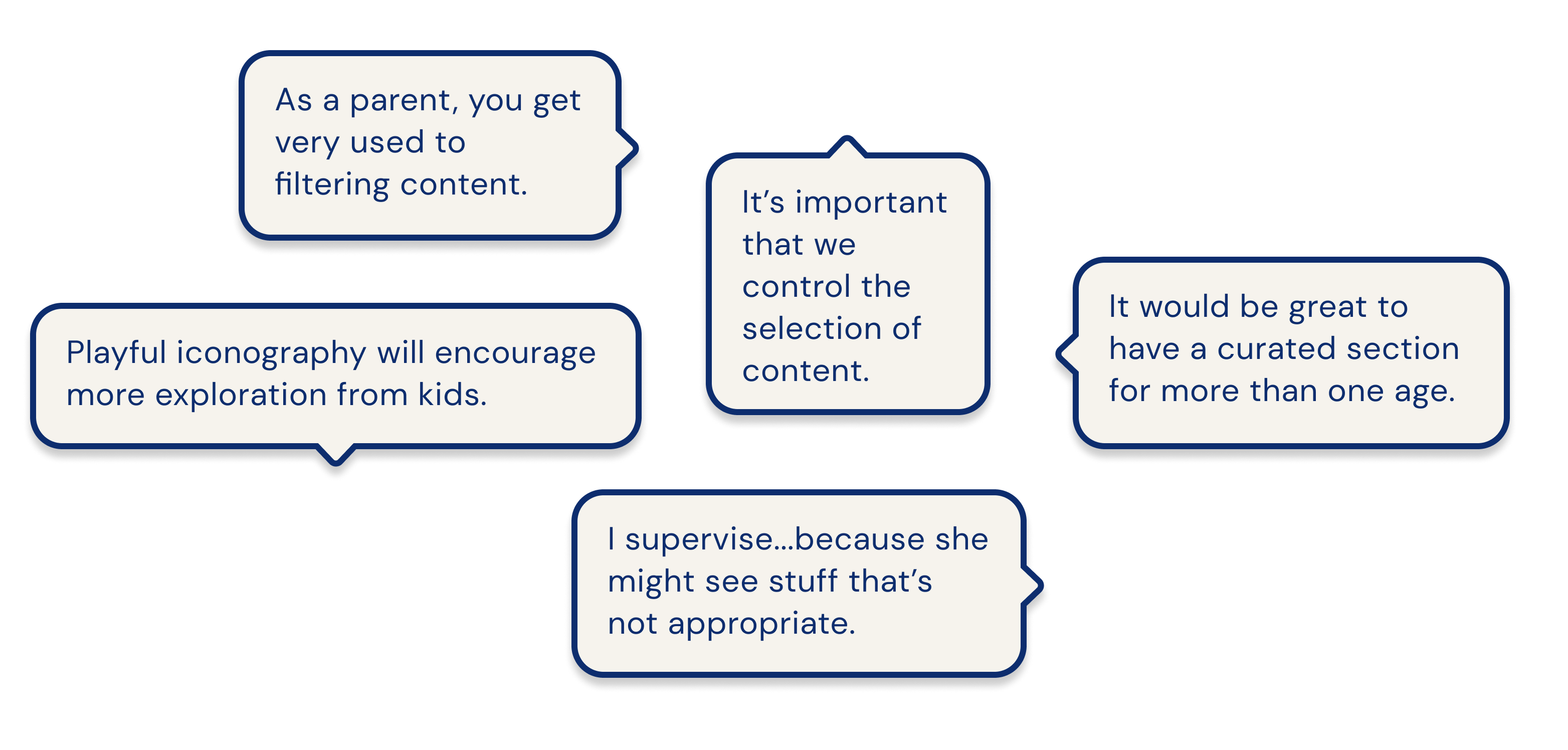
In which we identified the two most popular grievances:
ONE
Perfnwajr
Increafreaerfa
Orfeafcrea
TWO
FOUR: THE MVP EXPERIENCE
DEVELOPING
Launching an MVP experience
After our second shareout to stakeholders, we were excited as they wanted to move forward with our proposal and have requested that we provide designs for a low-lift MVP Kids experience. They wanted to get a basic experience that could be implemented fairly easily to the current Verizon platform. So we shifted our focus towards creating an MVP experience, and paused our enhanced explorations for now. We had a criteria to follow, which was:
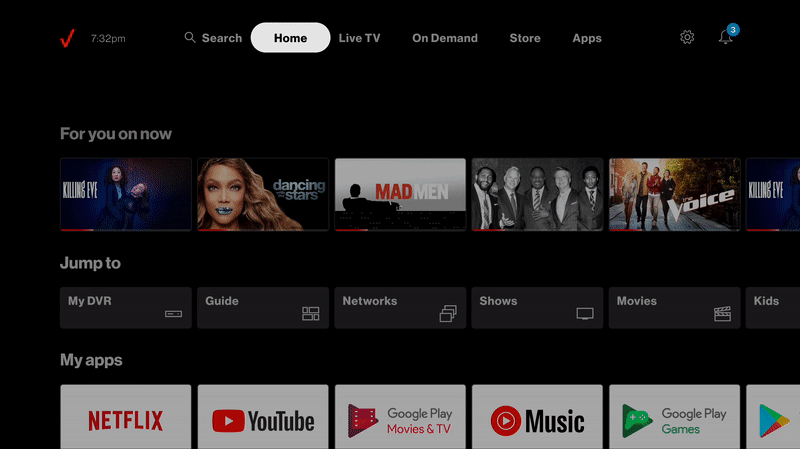
︎︎︎ Entry point would be within a Jump to shortcuts rail on the Home page of the core experience
︎︎︎ The Kids experience would be a secondary browse view, which meant no toggle and PCON that we explored previously
︎︎︎ We can still use filters as designed previously
︎︎︎ Curation team (Verizon) will provide the rails along the lines we have suggested
REFINING
MVP TV: FCL Entry points
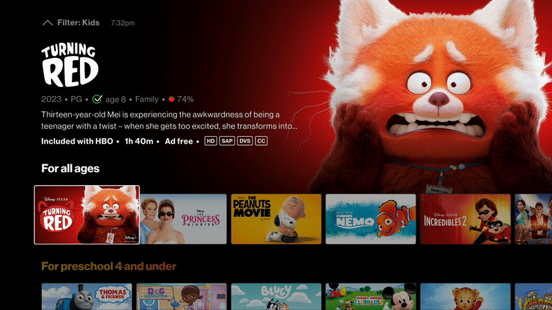
All our designs so far have been for TV, so that’s where we started. Within the Verizon platform, we had to design for FCL (Fios Custom Launcher) and STV (Stream TV) for TV, and we have only been designing for FCL. Focusing solely on FCL first, we took our previous designs and started to visualize how we can utilize an existing pattern within the design system and apply it to the MVP designs. We removed the toggles as an entry point and used the jump to rail instead.
Before:
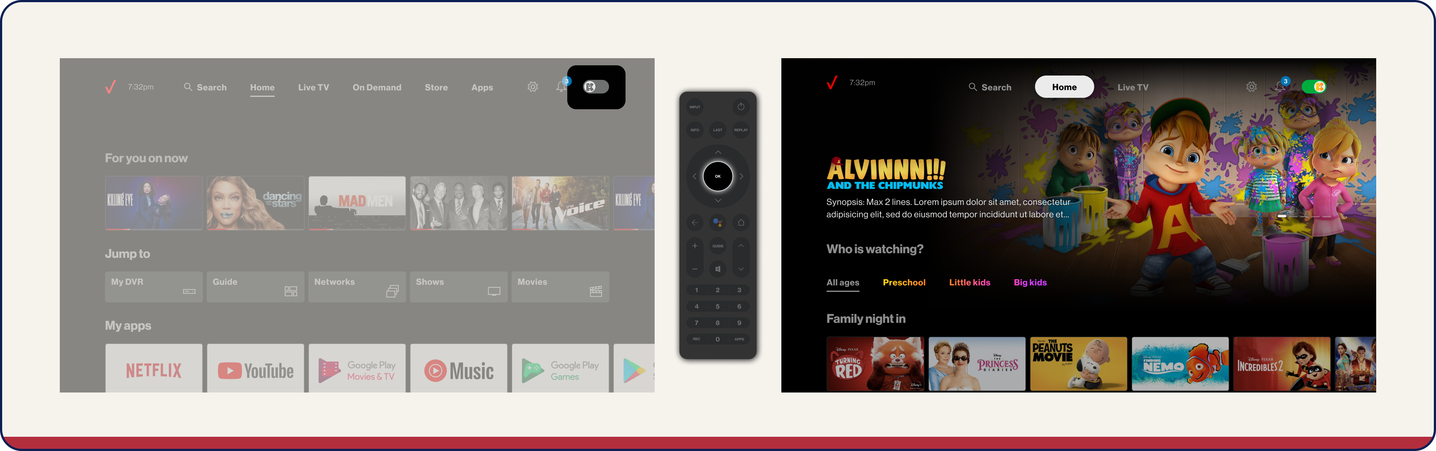
A playful entry where users can toggle into the Kids Universe, located on the top level menu of the experience.
A playful entry where users can toggle into the Kids Universe, located on the top level menu of the experience.
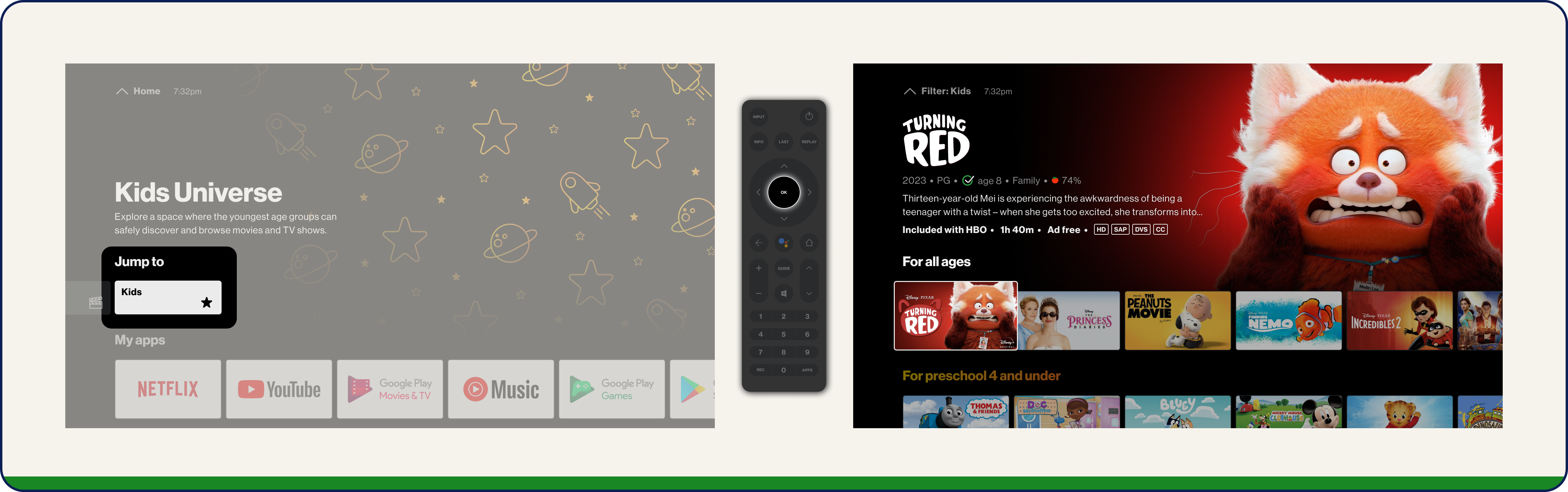
After:
Using the existing Jump to rail located in the core experience where users can ‘jump’ to the Kids Universe rails.
Using the existing Jump to rail located in the core experience where users can ‘jump’ to the Kids Universe rails.
REFINING
MVP TV: FCL Filters
The next thing we had to figure out was applying the filter of age ratings on the existing filter template in the design system.
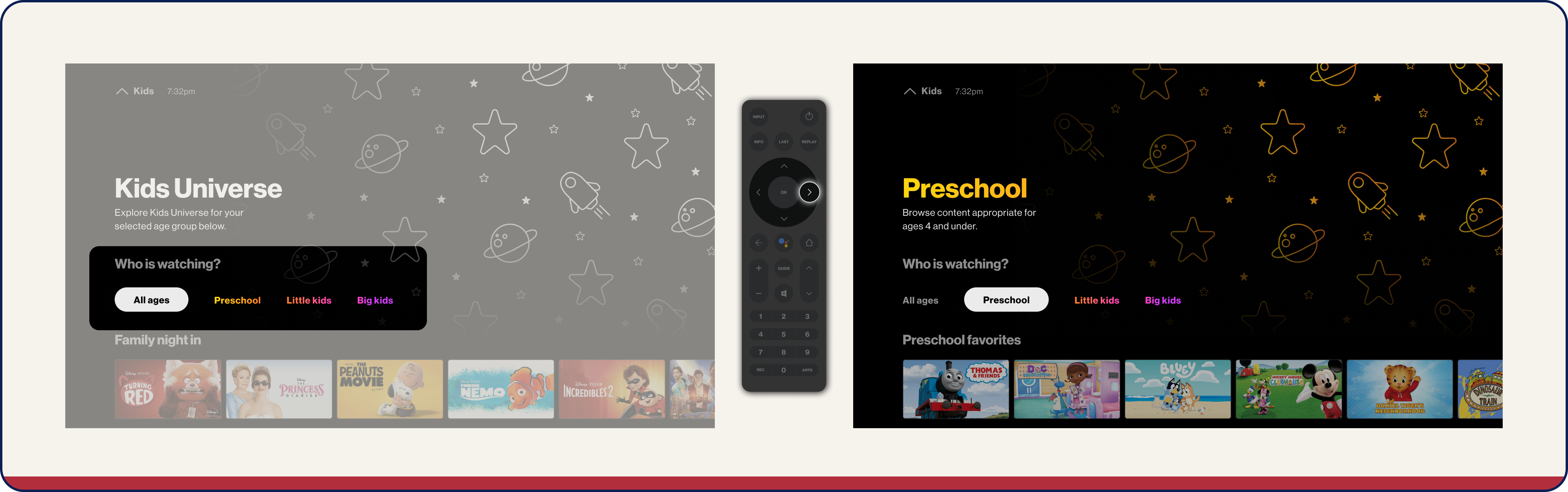
Before:
Filters were located in the Kids Universe home page once toggled into the experience in the form of tabs above the rails.

After:
Using the existing filters pattern in FCL’s design system, users can navigate up to the filter selection breadcrumb where they can press and choose a filter.
REFINING
MVP TV: FCL customize ‘Jump to’
REFINING
MVP TV: Stream TV entry points
The ‘Jump to’ pattern was native to FCL, so it did not exist in Stream TV’s design system. However, this is something that Verizon wants to apply to Stream TV as well, to ensure everything is consistent throughout all their products. To do this, I had to build it in the STV design system:
REFINING
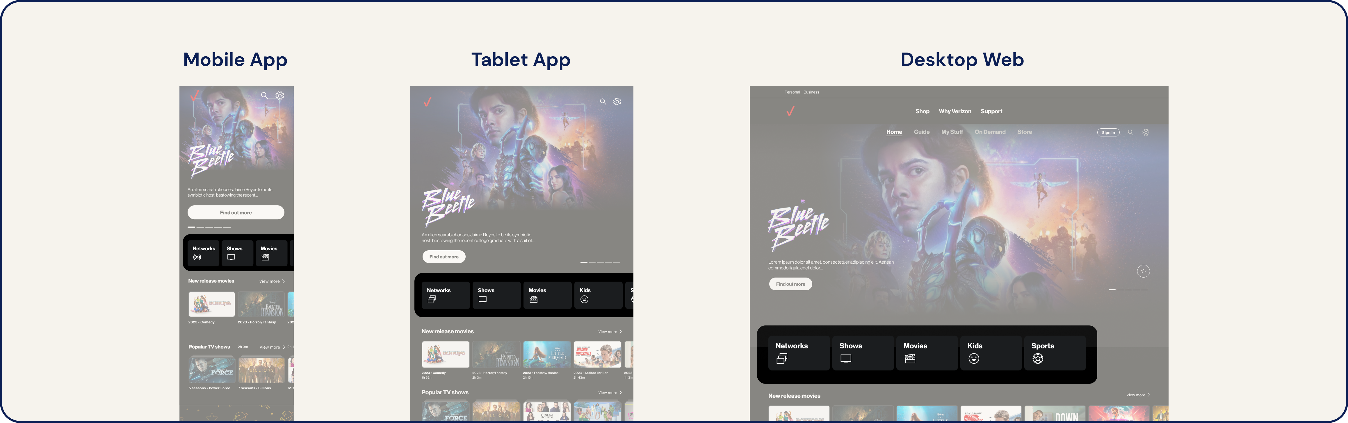
Since we wanted to launch Kids as an MVP experience, we also had to dive into how it would look on app and web. We have always designed for TV in this project, so we really had to think about the real estate of how it would look like on a smaller scale and how it can be applied to the UMW design system.
When it came to entry points, we narrowed it down to three options:
MVP UMW: App entry points
Since we wanted to launch Kids as an MVP experience, we also had to dive into how it would look on app and web. We have always designed for TV in this project, so we really had to think about the real estate of how it would look like on a smaller scale and how it can be applied to the UMW design system.
When it came to entry points, we narrowed it down to three options:
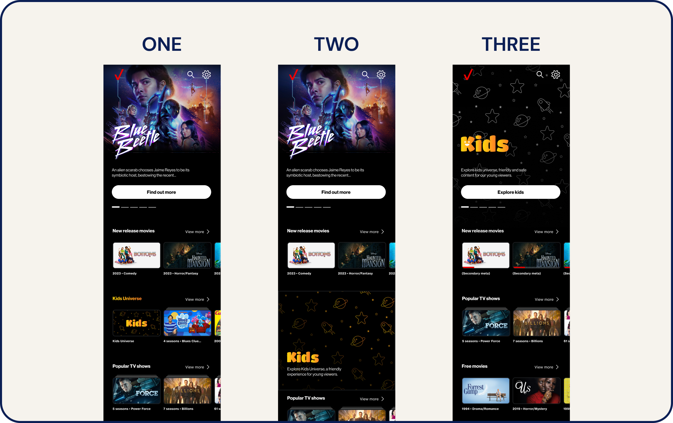 *tap to zoom!
ONE
TWO
THREE
Rail card entry
The entry point acts as a card in a Kids Universe rail.TWO
Promo banner entry
A banner promoting the Kids experience that is clickable to enter the Kids Universe.THREE
Hero entry
The first section and immediate view of the core experience.From the options above, we narrowed it down to OPTION ONE, as that was the easiest to build for an MVP launch.
REFINING
MVP UMW: Filters
EXPLORING
In uniform with FCL and now Stream TV, we explored what would the Jump to pattern would be like on UMW as well. This is a new pattern, so we did several variations of potential designs. After presenting it to the client, we narrowed it down to this:
![]()
Having this pattern consistent throughout the experience contributed to the seamless aspect we strive for. With this implemented across App & Web, we started to see the vision of how
MVP UMW: Adding ‘Jump to’
In uniform with FCL and now Stream TV, we explored what would the Jump to pattern would be like on UMW as well. This is a new pattern, so we did several variations of potential designs. After presenting it to the client, we narrowed it down to this:
Having this pattern consistent throughout the experience contributed to the seamless aspect we strive for. With this implemented across App & Web, we started to see the vision of how
Goal:
Provide art direction, site architecture and value proposotion for the e-commerce website to ensure a smooth user journey.
REFINING
Design
Website
We started the design process by designing web first, only moving on to tablet and mobile once web was finalised. In addition to this, we also created an animation storyboard and used it as reference for when we made the prototype on AfterEffects. I personally am a Figma advocate and love creating prototypes on Figma, which was something I played around with. However, the animations on AfterEffects were a lot better and seamless presentation wise.
Design System Library
The des
REFLECTION
Key Takeaways
Being part of the enhancement of Verizon Kids experience is something I hold dear to me; this is the first project that I was involved in end-to-end with a lot of creative control. Through this, I grew in areas where I lacked, ranging from design research to user testing. I had the chance to form an even better relationship with our client, understanding what they needed and how to tackle that through design.
Although the scope is reduced down, we are still proud of our explorations and proposals and we believe that it has opened doors to get us to where we are now. The Kids experience in Verizon had so much potential and we did our best bringing it back to life, and hopefully our enhanced explorations will be picked up again post MVP and when the client is ready to take this on.