Spark
VOLUNTEER WORK • DIGITAL DESIGN & BRAND EXPERIENCE
— is a community of young, passionate and purpose-driven aspiring leaders dedicated to create positive social impact.

Role
Digital Designer
Animator
Illustrator
AR Experience Designer
Digital Designer
Animator
Illustrator
AR Experience Designer
Team
Valerie E. Lianggara (myself)
Valerie E. Lianggara (myself)
Skills
Illustration
Visual Design
Motion Graphics
Augmented Reality
Packaging & Merchandise
Digital DesignEmail Marketing Design
Illustration
Visual Design
Motion Graphics
Augmented Reality
Packaging & Merchandise
Digital DesignEmail Marketing Design
Tools
Adobe Illustrator
Adobe Photoshop
Adobe AfterEffects
Spark AR
Procreate on iPad
Adobe Illustrator
Adobe Photoshop
Adobe AfterEffects
Spark AR
Procreate on iPad
Timeline
September 2020 - January 2021
September 2020 - January 2021
The Challenge
One
Spark Impact is a community of young, passionate, & purpose-driven individuals dedicated to create positive social impact. In November 2020, it had plans on relaunching its operations and brand. As their Senior Graphic Designer, the challenge was to create a brand identity and establish a design system that embodies their vision and mission and is appropriate for users.
Two
In February 2021, Spark launched Spark Academy, a flagship program that aims to empower young people to lead differently and with purpose through a series of classes on building the know-how leadership in the impact landscape in Indonesia. To represent this, the challenge was to create new graphic elements to stand for the educational aspect of Spark Academy, while still maintaining Spark’s original identity.Three
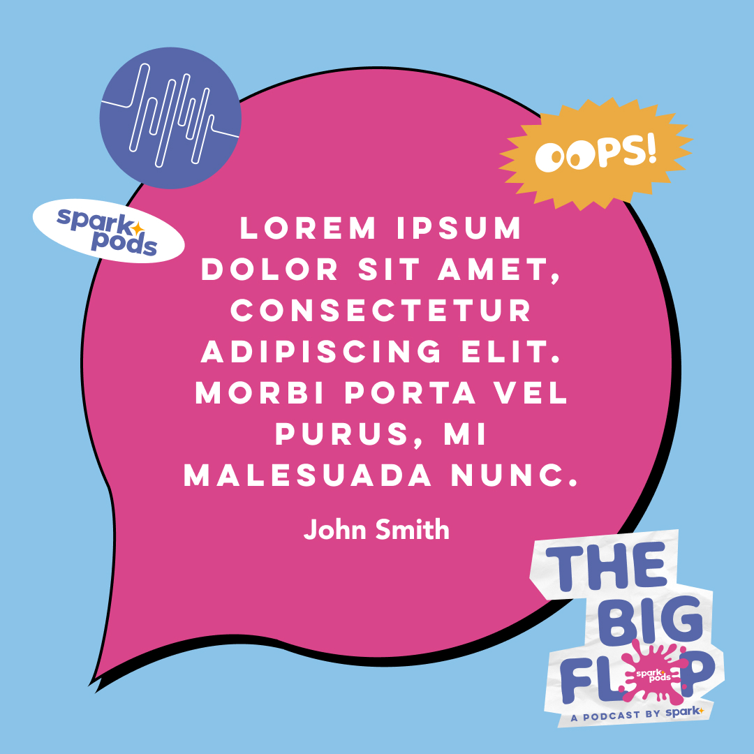
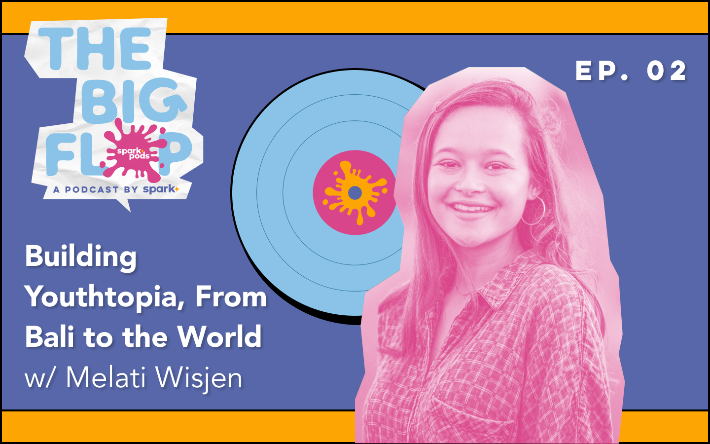
In April 2021, Spark launched our own podcast: SparkPods: The Big Flop. The Big Flop is about the tenacity and drive of young leaders in facing the challenges and hurdles ("flop experiences") they have had to overcome or failed to overcome in their journey, specifically how those experiences allow them to become better leaders and bring bigger impact in what they do in their respective fields. The challenge was to create an identity to rightfully represent the effort to provide content and perspective in hopes of shifting the idea of what success really means and the value of "flops", and strategise to create a brand identity that embodied the idea of failures and turnarounds.
The Solution
One
I was inspired by the idea of the north star, as it symbolizes direction as it glows brightly to guide and lead our audience toward a purposeful destination. Through this, I started out by designing a logo that embodies that vision, and proceeded to design brand collaterals and establish a design system for Spark to increase design workflow for other designers.
Two
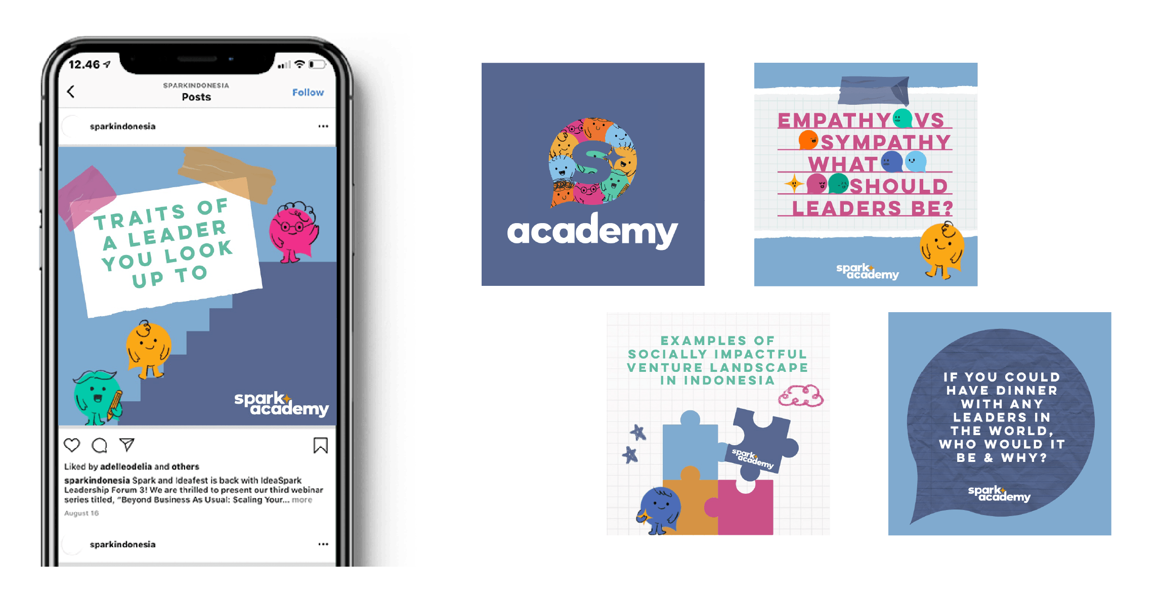
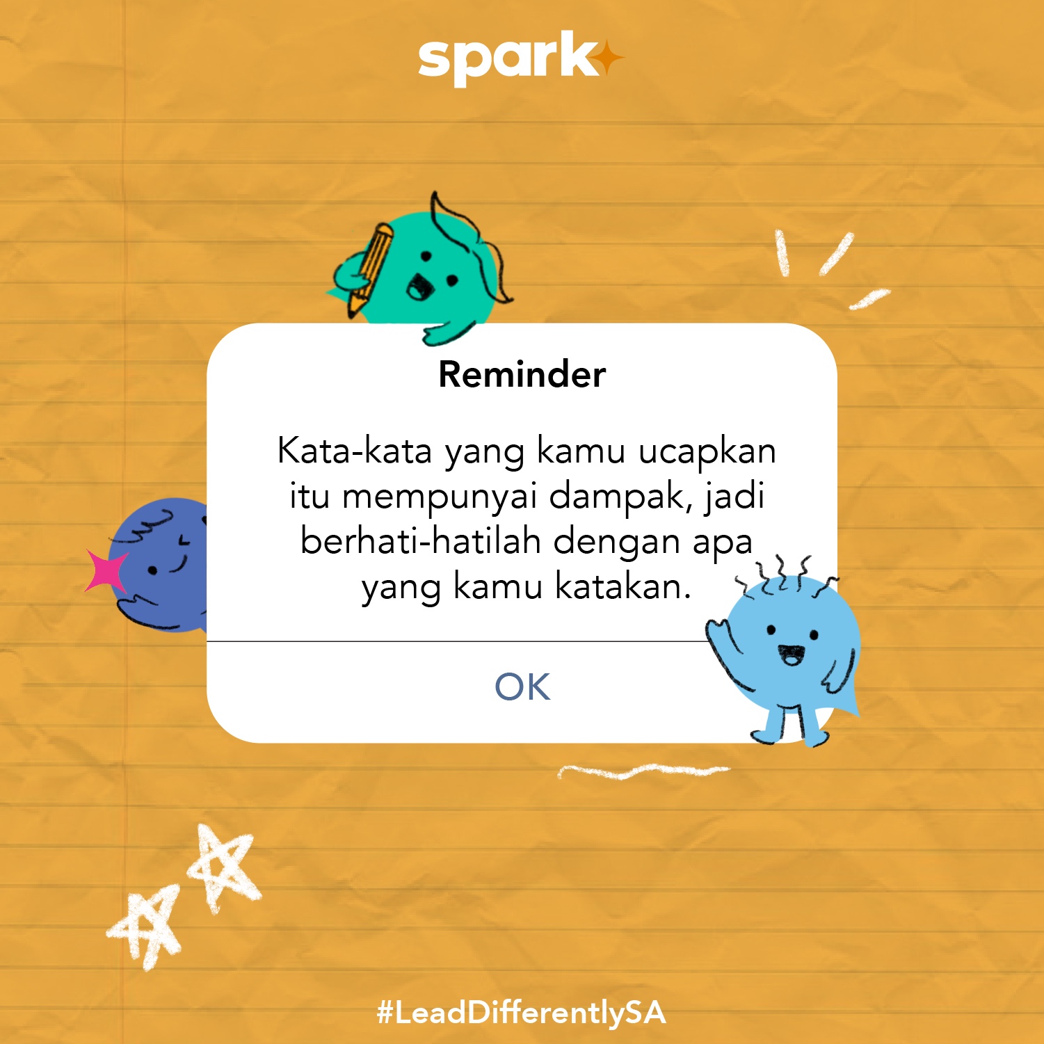
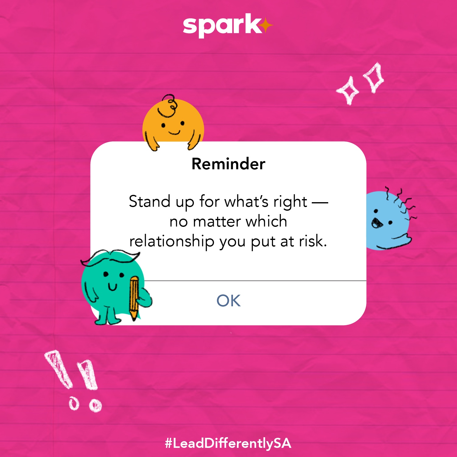
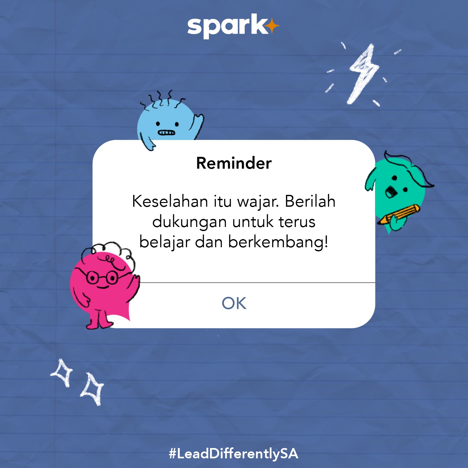
For Spark Academy, I wanted to communicate the leadership spirit of learners, which was done primarily by designing characters as supportive ‘mascots’ for the program.
SPARK’S INSTAGRAM ︎
Three
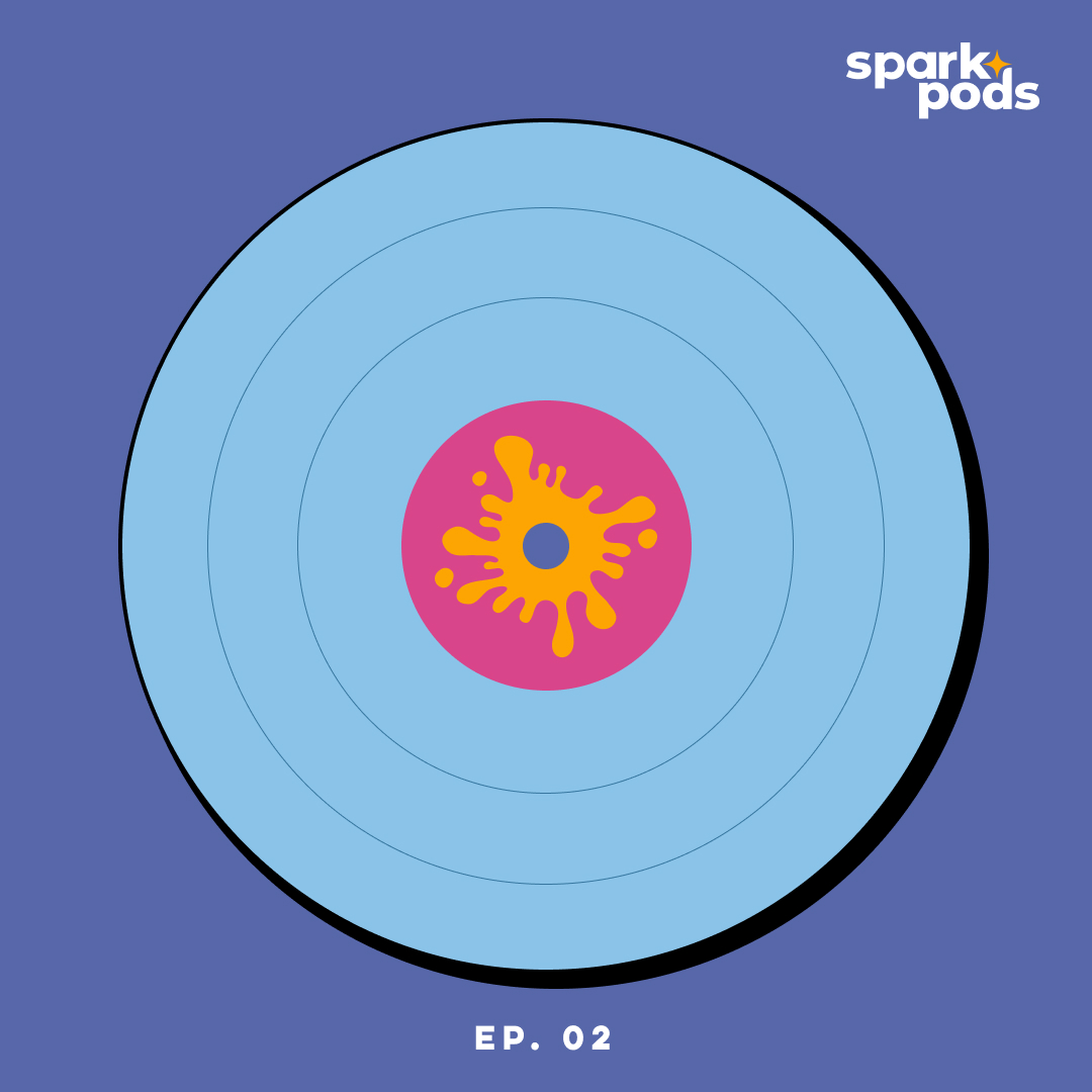
For SparkPods: The Big Flop, I wanted to utilise the imagery of failure. The initial options were either a splash, a banana peel or an upside down arrow. After going through multiple iterations, the team and I decided on the splash and having an arrow on the letter G in The Bi(G) Flop.
LISTEN ON ︎
ONE: SPARK RELAUNCH
CONTEXT
Main Goal
Spark’s key activities are to inspire, empower & equip young individuals with the knowledge, role models, & social capital needed to make a positive difference in society. With the relaunch of Spark, we want to be “top of mind” when people think of a community of young, passionate, and ambitious leaders wanting to create positive social change in Indonesia.
RESEARCH
User Statistics & Target Audience
Describing our ideal user/customer, these are the data analytics on our target market:
Target Age: 15-29
︎︎︎ Customer 1: high school student in national+ and international school
︎︎︎ Customer 2: university student abroad
︎︎︎ Customer 3: higher tiered local university student
︎︎︎ Customer 4: young professional, any industry, 1-5 years of work experience
Personality: open-minded, curious, life-long learners
Attitude: hustles, ambitious Interests: volunteering, avid social media user, stays up to date with news, involved in organizations Lifestyles: hangs out with friends, watches documentaries, book readers
Values: community, social change
Languages spoken: English & Bahasa Indonesia
EXPLORE
Logo Design
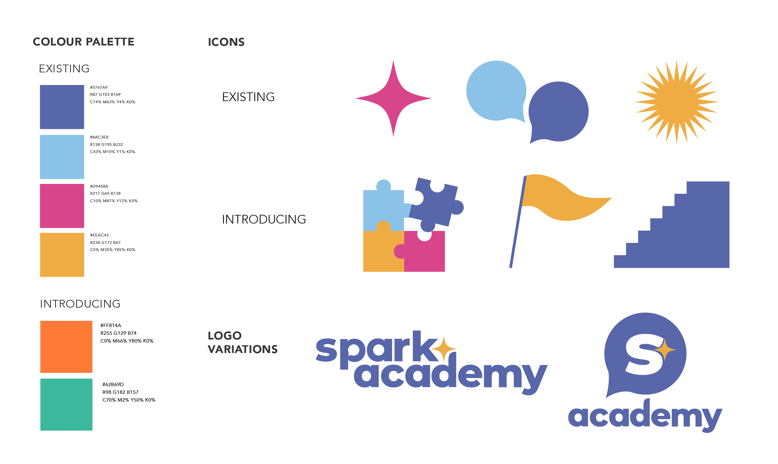
Understanding the vision, mission and target audience of Spark, I played around with different icons that encapsulated their brand and what message they wanted to communicate. Such icons included a lightbulb, fire, speech bubbles, stars, lightning bolts, and much more. I visualized these elements through rough sketches, as seen below.
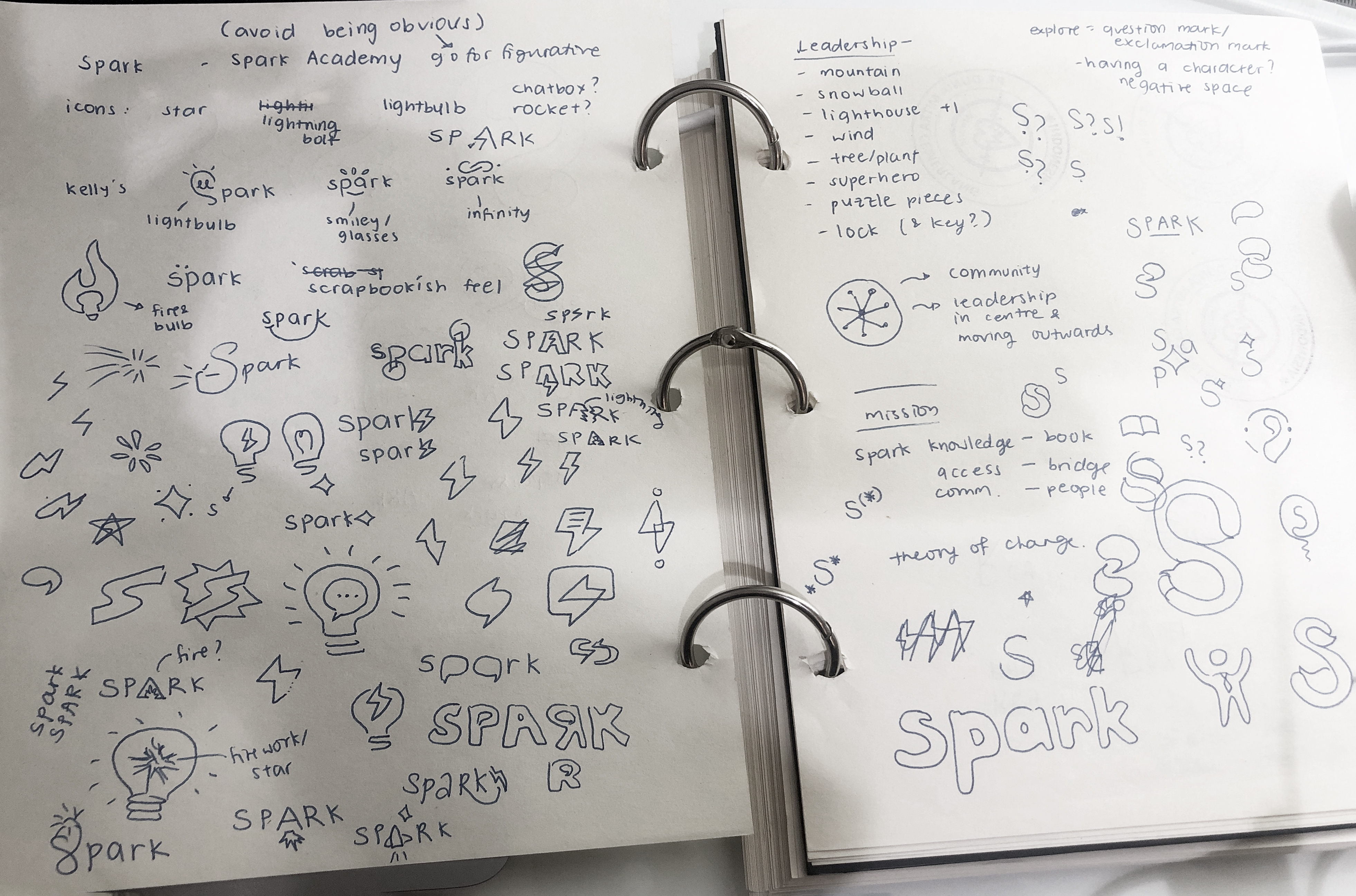
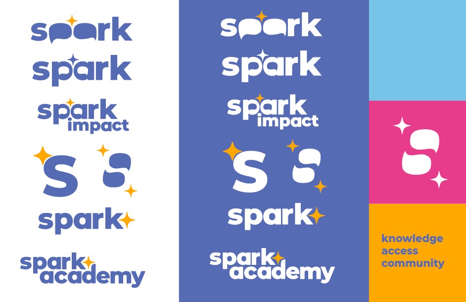
From hand-drawn sketches, I proceeded to digitize them on Illustrator. I created several options and explored colour options to present to the team.
Post presentation pitch, I acted on the feedback to solidify the logo concept and narrowed it down to three options.
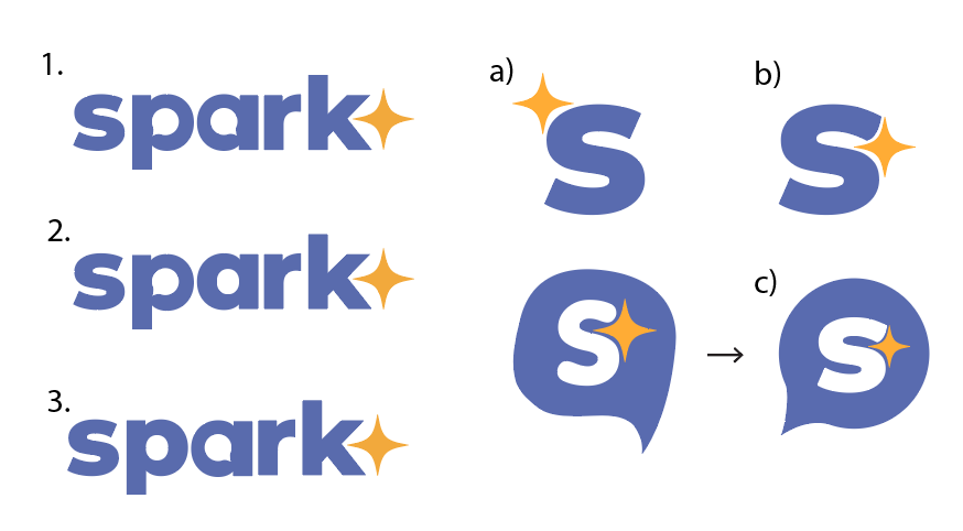
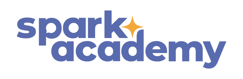
Final logo and icon:
DESIGN
Visual Identity

DESIGN
Motion Graphics
New logo reveal animation


Motion graphics to tease the relaunch for social media accounts
DESIGN
AR Filter
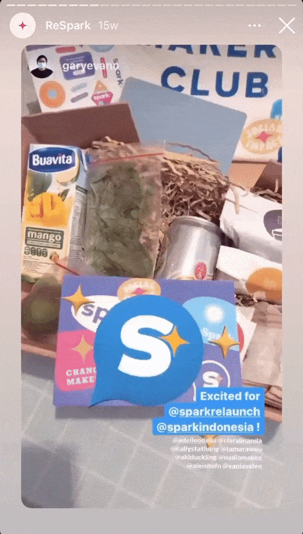
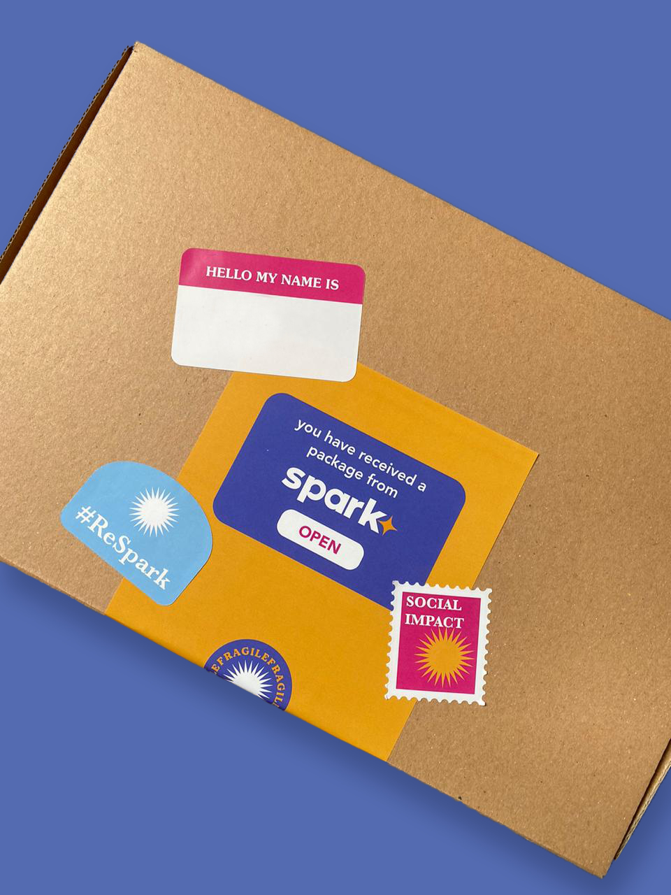
For the relaunch event of Spark, I wanted to include an interactive element for users. As we plan on sending out PR packages filled with merchandise and a postcard as a message from the team, I thought of taking advantage of the postcard by creating a design that can be scanned as an Instagram filter. I did not limit myself to a two-dimensional realm of design and decided to push myself in creating a 3D augmented reality Instagram filter. This is activated using the filter available on Spark’s Instagram page, where users can scan the design on the postcard to activate.
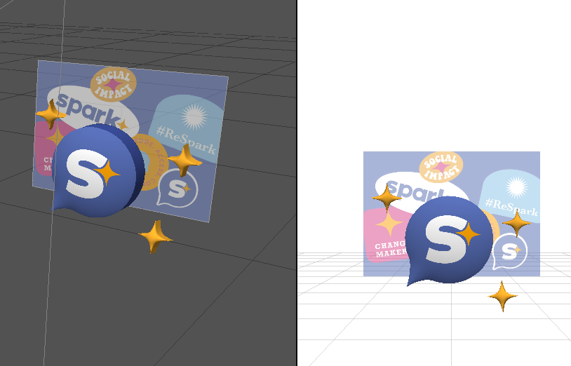
Designing the filter on SparkAR
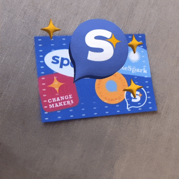
Testing out the filter on the printed postcard
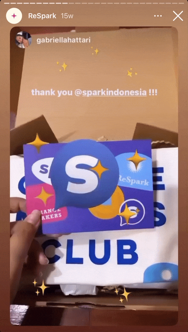
Users using the filter during the relaunch event
DESIGN
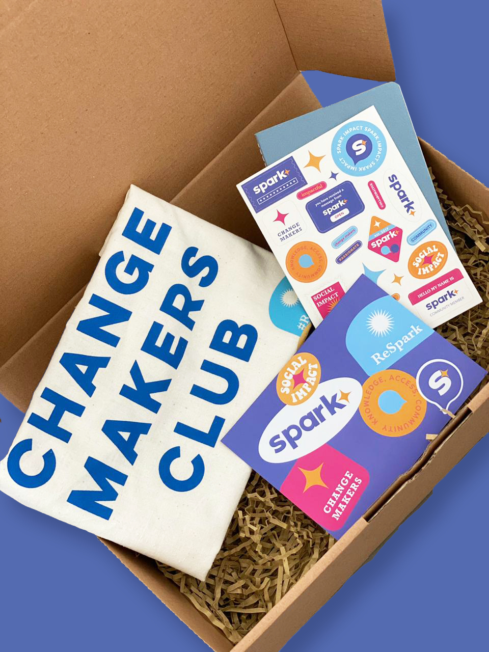
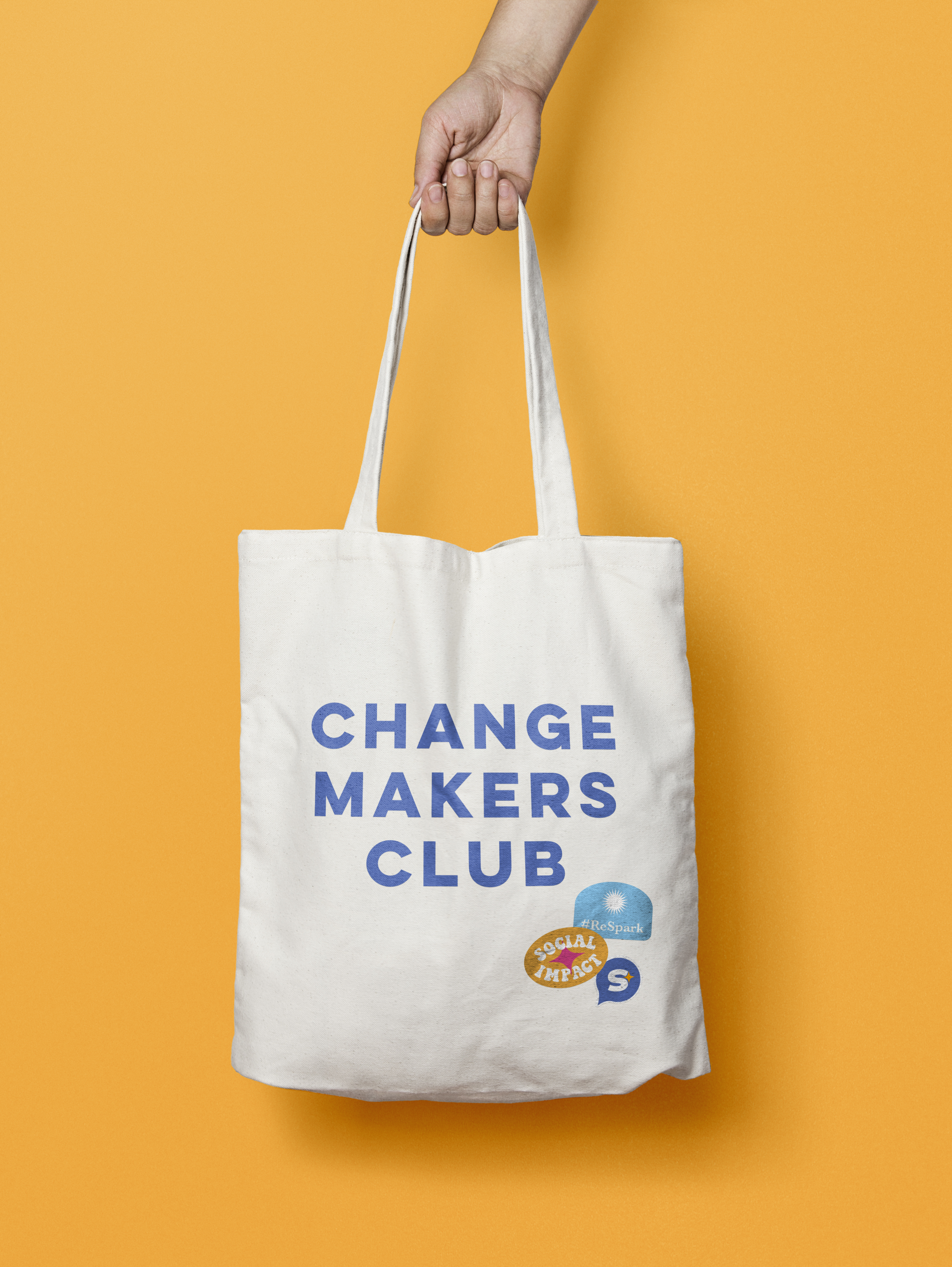
PR Merchandise

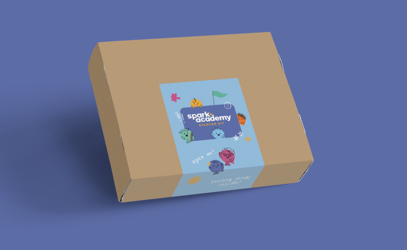
TWO: SPARK ACADEMY
EXPLORE
Logo Design
Taken from Spark’s existing logo, I created a subsidiary logo for Spark Academy:
DESIGN
Visual Identity
Character Design
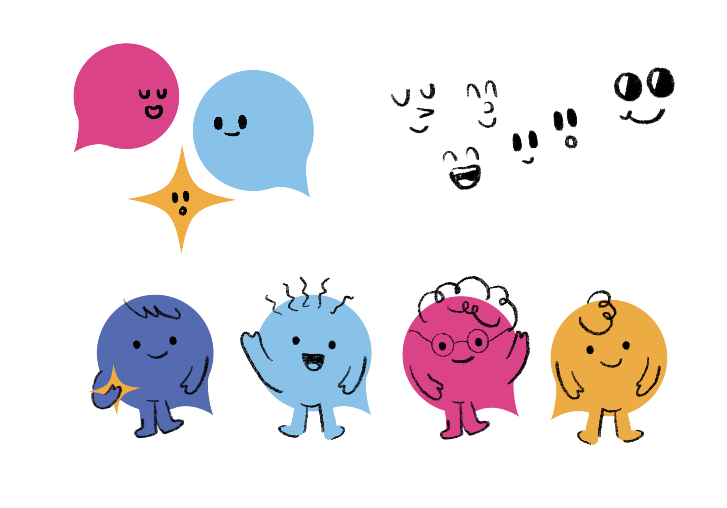
Part of my thought process was to always think of a way to increase the quality of user engagement by designing characters to act as a mascot. By introducing an element that has humanistic traits, it automatically creates a recognizable personality. From this, I started out by sketching and visualizing some character ideas, using the speech bubble in Spark’s logo as the body.
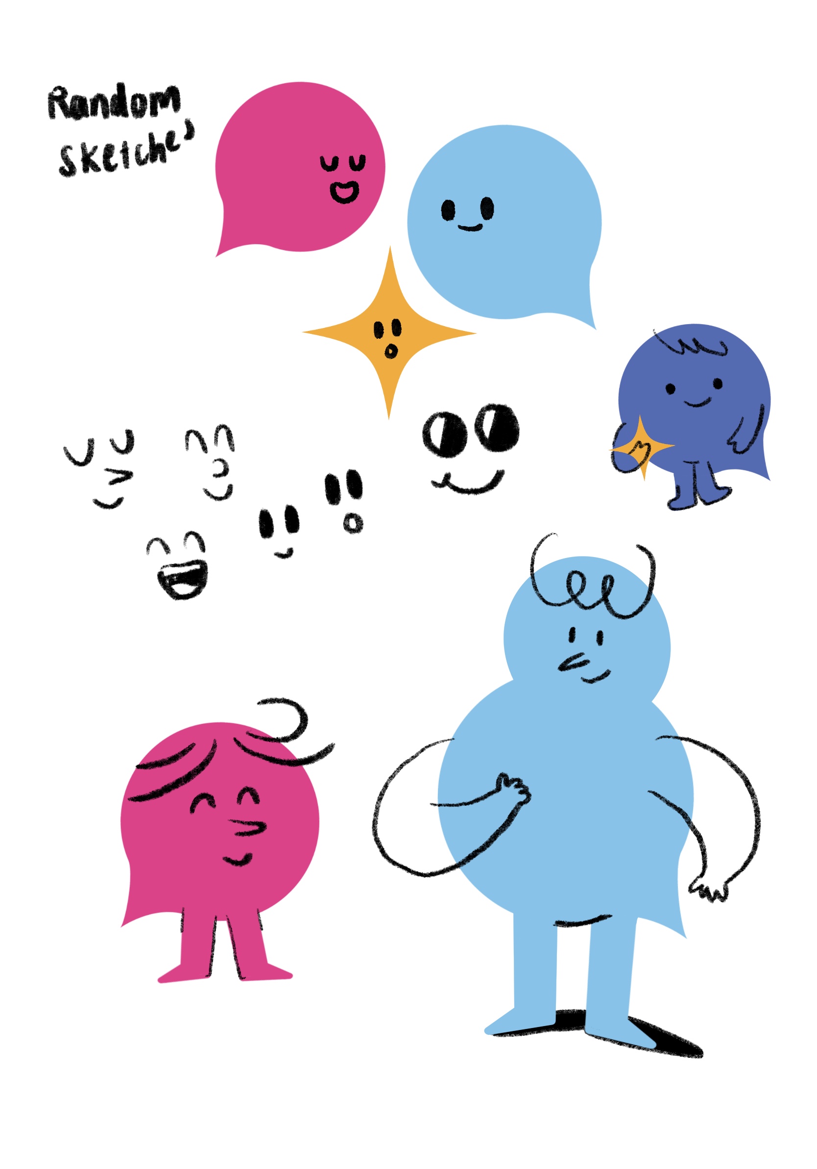
Initial sketches
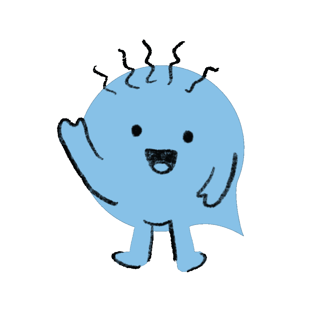
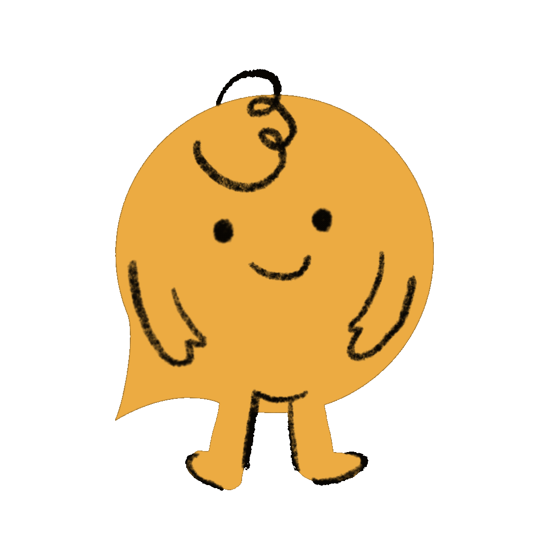

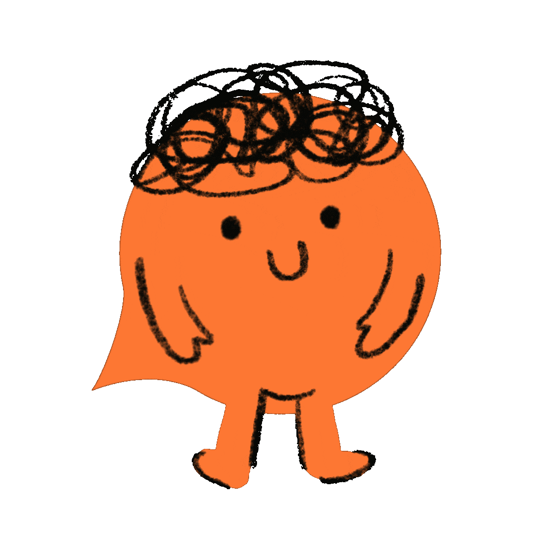
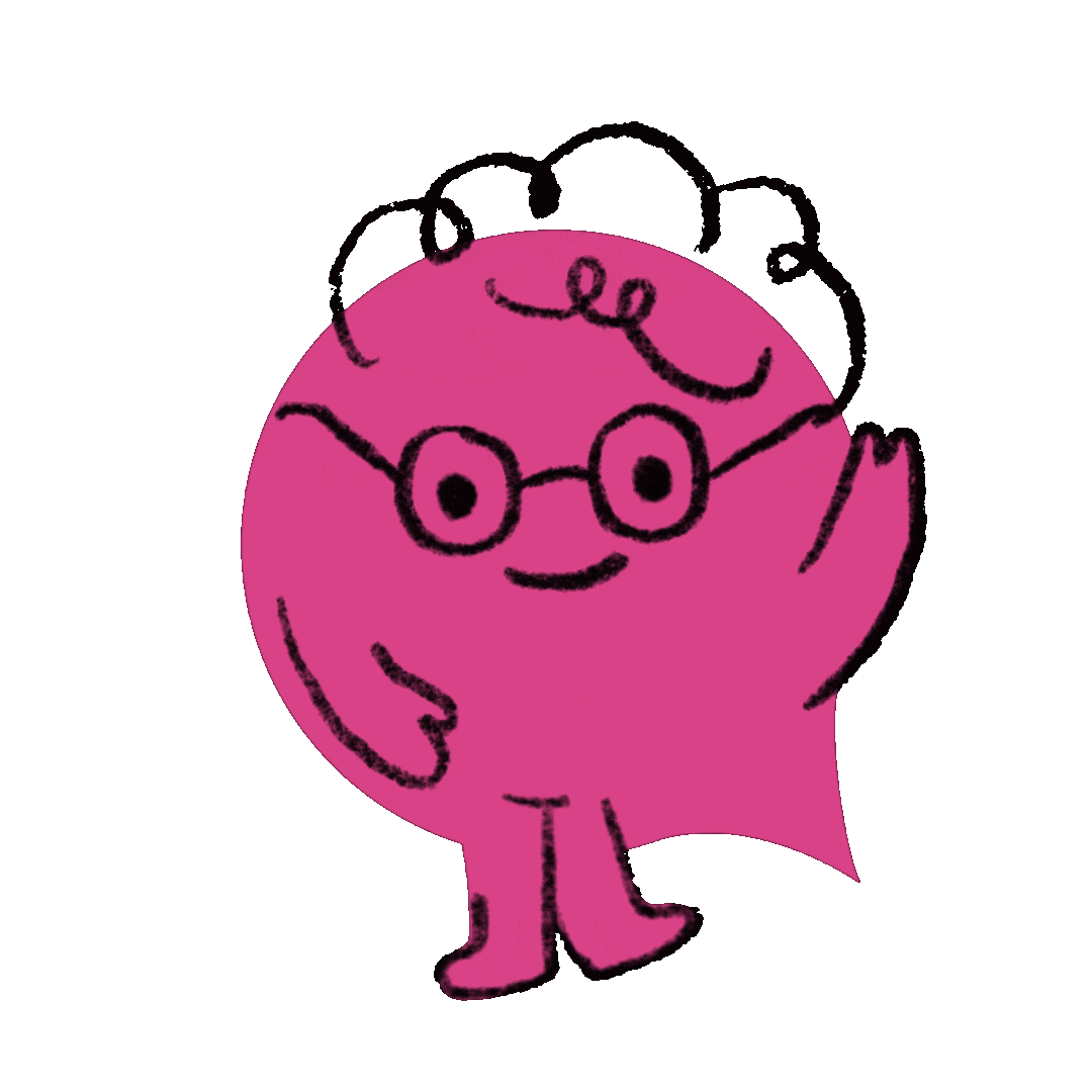
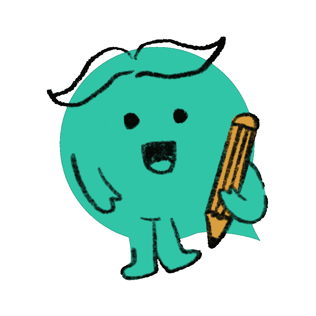
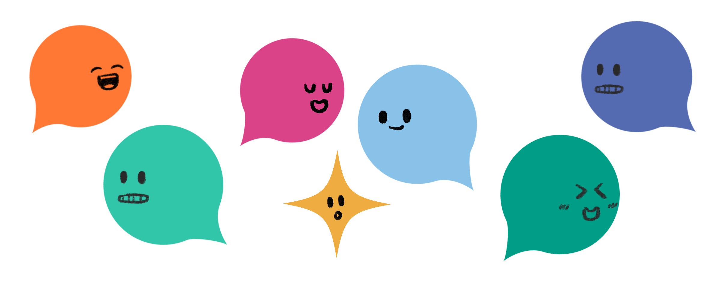
Final characters
DESIGN
PR Packaging
MARKETING
Social Media Assets


MARKETING
Stickers & GIPHYs

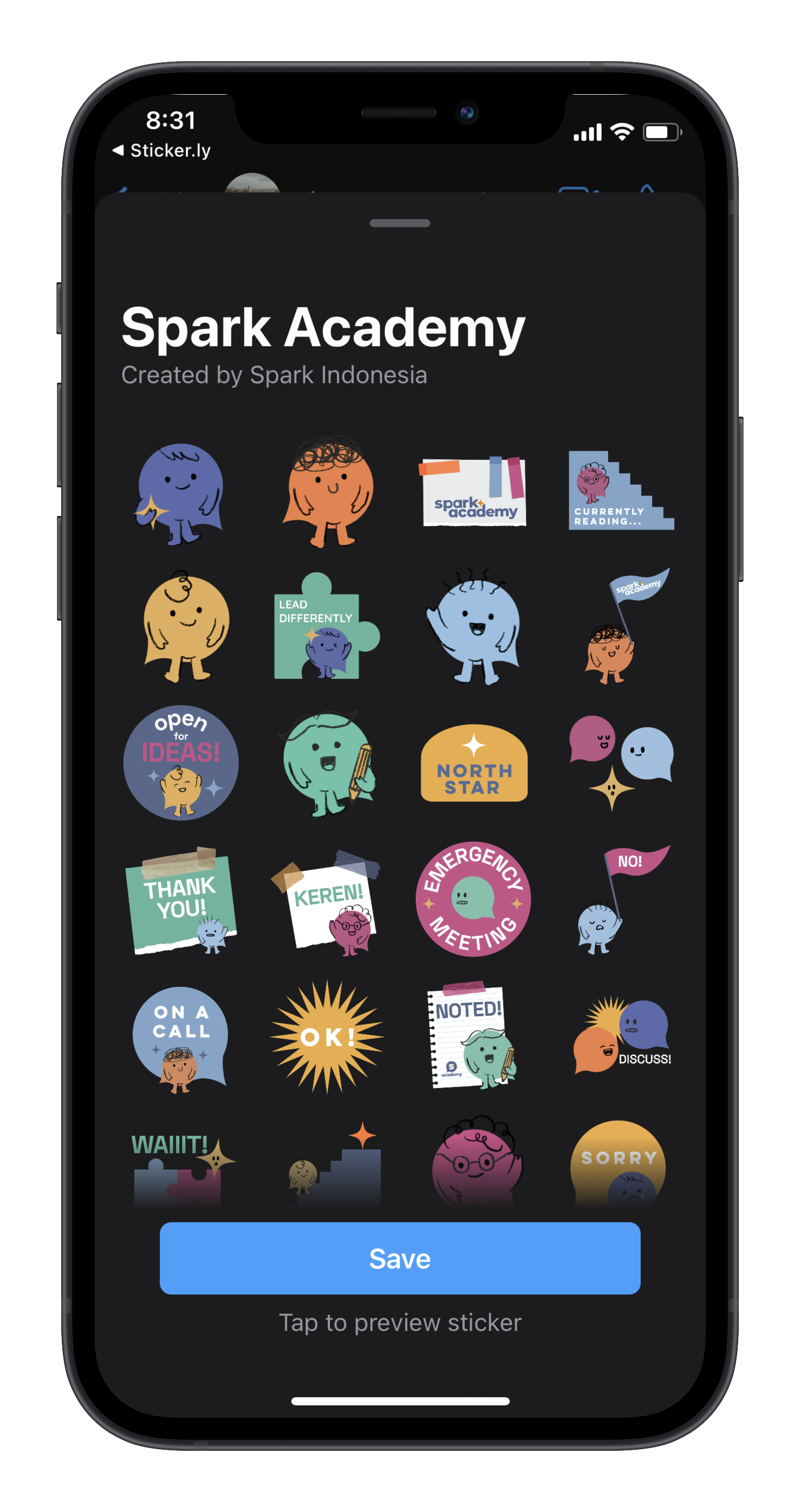

*search ‘leaddifferently’, ‘sparkimpact’, ‘sparkacademy’ or ‘leaddifferentlysa’ to use these GIFs across GIPHY supported social media platforms!
THREE: SPARK PODS - THE BIG FLOP!
EXPLORE
Logo Design
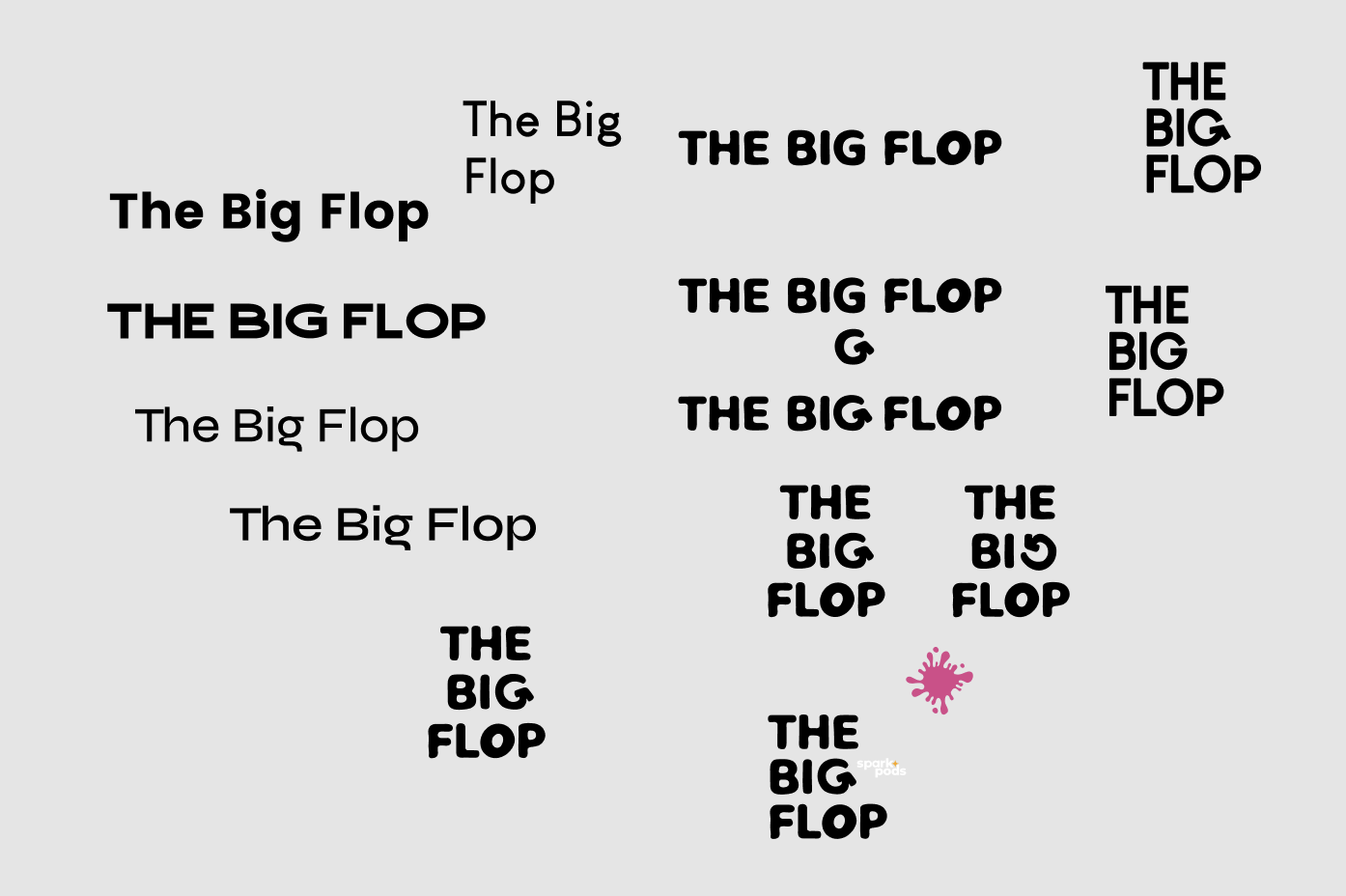
In the initial stages, I played around with different fonts to create the logo for The Big Flop. Since it was an entirely new program that did not involve the word ‘Spark’, I had to think of something new that was different from Spark’s original logo. As seen below, I played a lot with the letter ‘G’ in the word ‘BIG’ as it resembled the shape of an arrow.
I initially decided to go with a typeface called Syne and its Extra Bold style. As seen below, I used that option and explored different social media post styles and implemented the colour palette into it. I created Instagram post options, Youtube thumbnails and podcast covers.
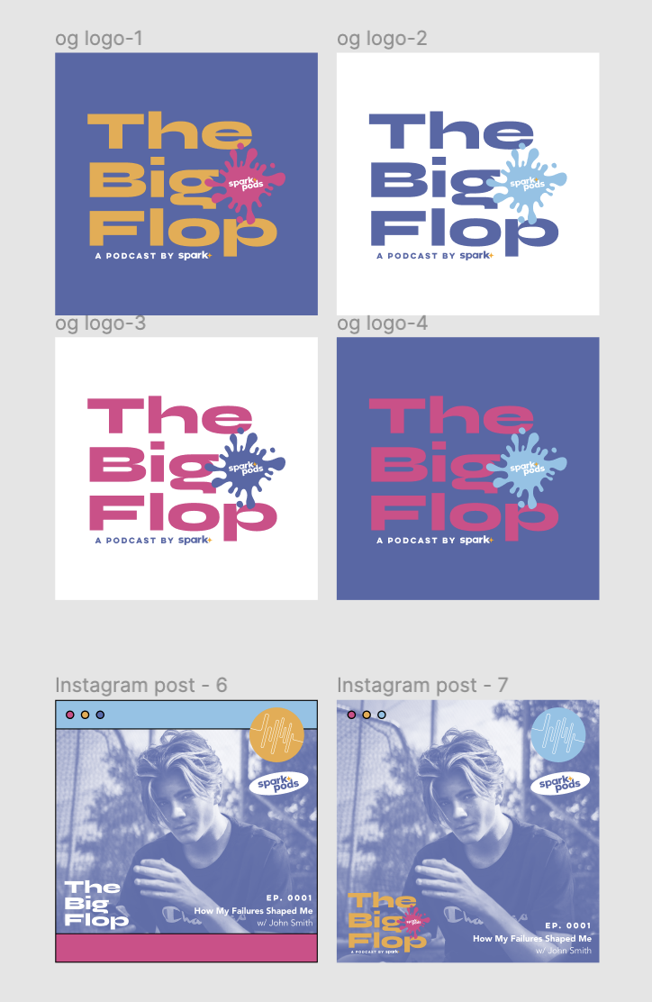

However, after discussing with the production team, they wanted something more playful and illustrative. Hence, I showed them variations of the logo created using the typeface Milky Nice, where the letter ‘G’ in the word ‘BIG’ is turned into an arrow. I also implemented a paper-textured background that outlined the logo as an option, which the team liked. The red circles were placed on options the team preferred.

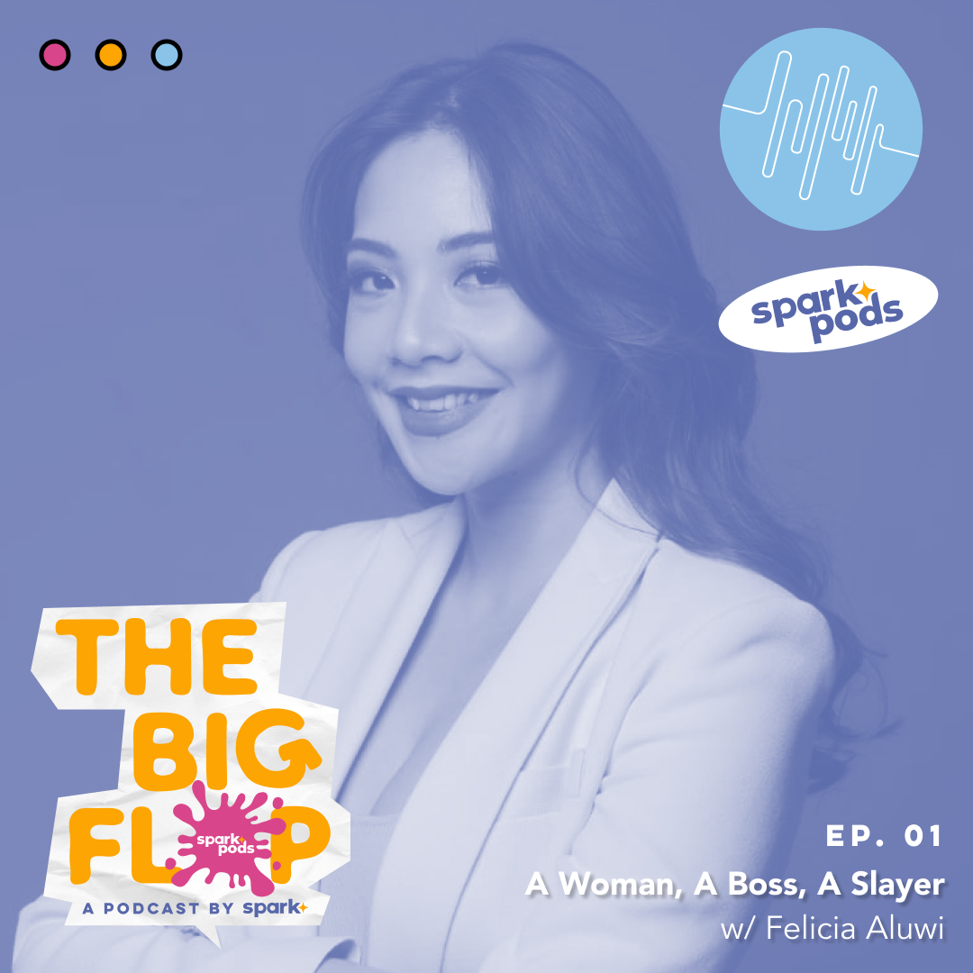
Final Logo:
MARKETING
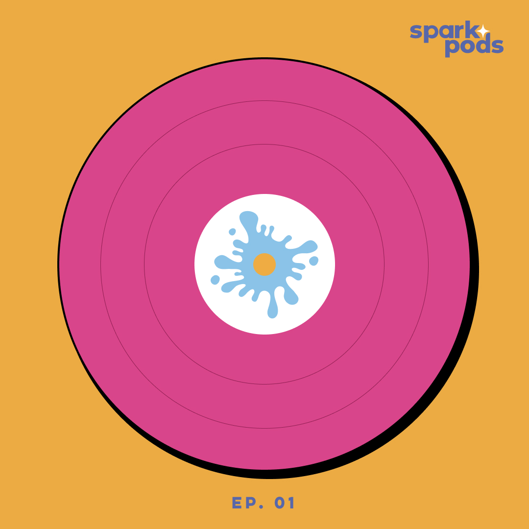
Social Media Assets


Final Experience
Podcast available on Spotify!
Video available on YouTube!
REFLECTION
Key Takeaways
Being able to bring Spark’s vision to life visually has been one of the most rewarding experiences. This ongoing personal project reminded me of how much really goes into making and highlighting an experience, especially through digital design and brand experiences. I feel very lucky to have been given a platform to promote such a meaningful and impact message through design.
A challenge that I’ve faced and am still continuing to face today is time management - as this is a side project that involves a lot of commitment, I tend to lose track of time due to school work and not have the ability to fulfill deadlines for Spark. However, I learned that collaboration is key and that my team is always there to support me. With the recent recruitment of designers reporting to me, I feel humbled and honored to have a team behind me to help what once was a one person job.
Throughout the design process, I realize that design is a circular process and there really is no end. With Spark, I hope to create more positive social impact within my field of work, and perhaps one day implement my knowledge in product thinking into the work we will produce.