Client Website (NDA)
OVERVIEW • NATIVE DESIGN • UX/UI & WEB DESIGN
– designing an e-commerce website for first time users and a logged in experience for subscribed users for a tech company’s newest product launch.
Role
UI Designer
UX Designer
Motion Designer
UI Designer
UX Designer
Motion Designer
Team
Valerie E. Lianggara
Heidi Tran
Keith Bone
Marcus Mustafa
Mark Rix
Valerie E. Lianggara
Heidi Tran
Keith Bone
Marcus Mustafa
Mark Rix
Skills
Web Design
UI/UX DesignVisual Design
Motion Graphics
Web Design
UI/UX DesignVisual Design
Motion Graphics
Tools
Figma
Miro
Adobe Photoshop
Adobe AfterEffects
Figma
Miro
Adobe Photoshop
Adobe AfterEffects
Timeline
December 2021 - June 2022
December 2021 - June 2022
Overview
My time at Native as a UI/UX Designer revolved around designing an entire e-commerce website for a long term client of the company. For their newest upcoming product launch, they needed a landing page, product page, buying journey and logged in experience. Together with another fellow designer, I was responsible for ideating, designing and prototyping the website.
While this project and client name is under NDA and I cannot elaborate on the product itself, I can share a few snippets of the responsibilities that I had and my experiences so far, which include:
︎︎︎ Creating visual moodboards to provide art direction
︎︎︎ Maintaining and updating the design system library
︎︎︎ Building and prototyping user flows for a smooth user journey
︎︎︎ Updating designs based on syncs with developers & client
EXPLORE
Understanding the client
Coming into the project when it was already well under way, I quickly adapted to what was already done and contributed my own thoughts and opinions to the existing work. Despite having some sort of a direction set, my team and I had to constantly keep an open mind in the scenario that the client changes their minds. Our goal was to provide art direction, site architecture and value proposition for the e-commerce website to ensure a smooth user journey.
Some things I took ownership of ︎︎︎
ONE
Visual moodboards to provide art direction
ONE
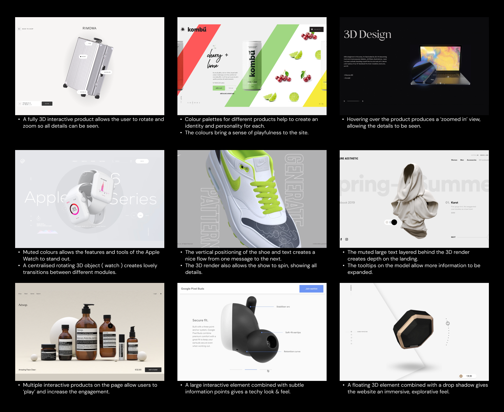
Before I joined the team, the art direction for the website and branding of the launch was not set in stone yet. Despite having some wireframes drawn up, there was still room to define the aesthetics of the launch. From this, my team and I created and worked around three different moodboards that each represent an artistic concept which were presented to the client:
1. Simple, clean, with hints of colour
2. Warm, editorial, human approach
3. Immersive, playful, 3D environments


TWO
TWO
Design system library
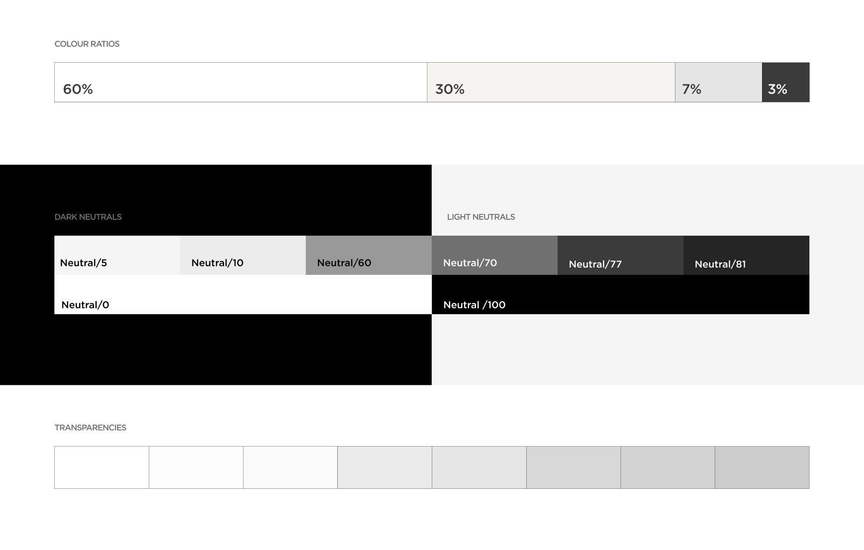
The design system library was already built when I joined the project, however, it was still at its early stages. This meant that I had the opportunity to build on this, which was one of my main tasks in this project. We tested colours that worked well with the image renders we were using of the physical product, and based it around hierarchy. As a result, we ended up with a neutral colour palette:
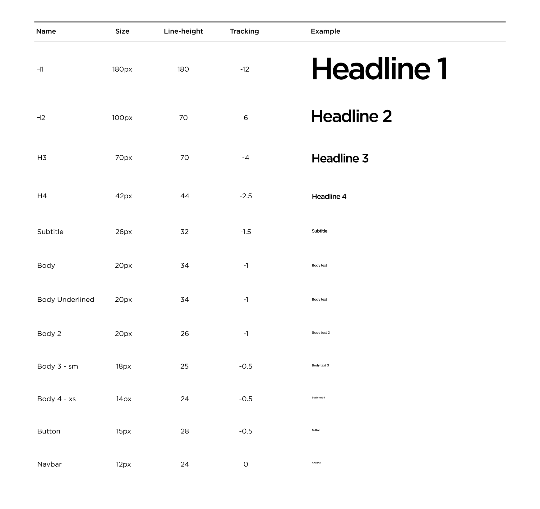
When it came to typography, the client’s font, Gotham, had to be used. I changed the tracking to be tighter because it looked too separated. This made the copywriting more legible and looked trendy, editorial, and bold.
THREE
THREE
User journeys
The design system library was already built when I joined the project, however, it was still at its early stag
︎︎︎ Main website
We started the design process by designing web first, only moving on to tablet and mobile once web was finalised. In addition to this, we also created an animation storyboard and used it as reference for when we made the prototype on AfterEffects. I personally am a Figma advocate and love creating prototypes on Figma, which was something I played around with. However, the animations on AfterEffects were a lot better and seamless presentation wise.
︎︎︎ Buying journey
Just like the design system library, the buying journey was already designed when I joined. However, the designs were still low-fidelity, and I was granted the task of converting it into high-fidelity. This meant that I would be adding more to the existing design system library, creating new templates from the components we already had.
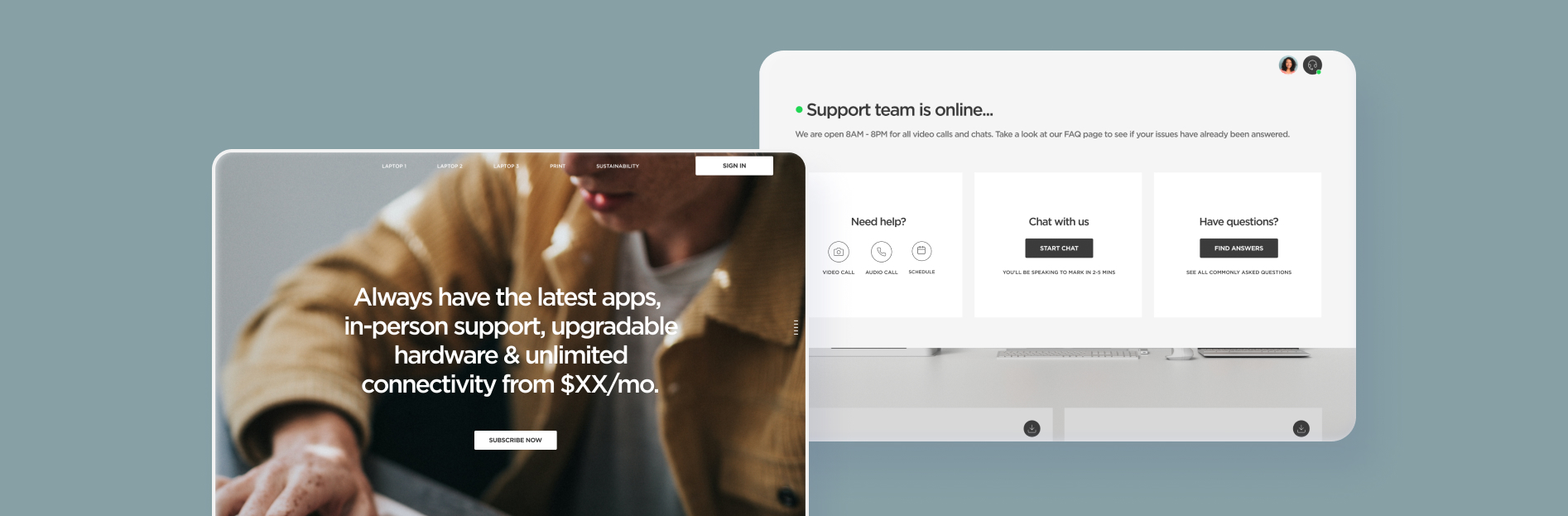
︎︎︎ Logged in experience
The first version of the logged in experience had a similar navigation to the main website, and it would show users all information regarding their device(s). However, it was very information heavy and the user had to do most tasks manually (e.g. updating their device). In addition to that, the copywriting had a negative tone of voice and heavily used semantic colours to represent issues. Due to this, I and a fellow UI designer took ownership of the redesign of the logged in experience.
︎︎︎ Companion App
As one of its unique features, the new product will have a companion app where users can seamlessly flow across devices. We crafted a plan for what features it will have access to for launch, and a customer journey to maintain continuity of usage.


FOUR
FOUR
Design decisions
As a junior designer, I did not get the chance to communicate directly with the client. However, I had the responsibility of owning most of the designs through the design director. We had catch ups internally and updated designs based on what the client wanted. This is an example of the types of audits we would do for the main website, which allowed users to browse through what products were available for them to buy.
REFLECTION
Key Takeaways
This was my first exposure to a UI/UX design role, working for a real-life client in a design agency environment. I am very thankful for this opportunity despite not having previous professional UI/UX experiences, and have undoubtedly improved my skills through this project.
Excited and eager to learn, I soon realized that the way Native operates is that they work in cross-functional teams and don’t do things by the book; I was able to quickly adapt to the rapid and fast paced environment due to my interest and experience within different fields such as visual design, motion graphics, UX design and research. Working in an agency environment was something new to me, so I tried my best to be a sponge and absorb every thought process and technological skills that was presented to me.
I want to give the biggest shoutout to the mid-weight designer on my team, Heidi Tran, who mentored me throughout this project and always valued my ideas. We were constantly ideating new and better designs to get new business from the client. Although I am no longer part of this project as I have left Native before it launched, it was an exciting project and I really enjoyed being a part of it.